class: center, middle # Space .class-info[ **Week 11** AEM 2850 / 5850 : R for Business Analytics<br> Cornell Dyson<br> Fall 2025 Acknowledgements: [Andrew Heiss](https://datavizm20.classes.andrewheiss.com), [Claus Wilke](https://wilkelab.org/SDS375/), <!-- [Grant McDermott](https://github.com/uo-ec607/lectures), --> <!-- [Jenny Bryan](https://stat545.com/join-cheatsheet.html), --> [Allison Horst](https://github.com/allisonhorst/stats-illustrations) ] --- # Announcements Group project due next Friday, November 14 Office hours by appointment at [aem2850.youcanbook.me](https://aem2850.youcanbook.me) **Thursday's in-class example = this week's homework** - Goal is to get practice without overloading you given the group project deadline next week - Next Monday's office hours will be reserved for group project questions Questions before we get started? --- # Plan for today [Course progress](#progress) [Prologue](#prologue) [Adding data to maps as layers](#data-on-maps) [Geospatial visualizations in R](#gis-in-r) [A quick primer on projections (for reference)](#projections) Disclaimer: I am not an expert on working with geospatial data. I just want to give you a sense of the possibilities! --- class: inverse, center, middle name: progress # Course progress --- # Course objectives reminder 1. Develop basic proficiency in `R` programming 2. Understand data structures and manipulation 3. Describe effective techniques for data visualization and communication 4. Construct effective data visualizations 5. Utilize course concepts and tools for business applications --- # Where we've been (weeks 1-4) 1. **Develop basic proficiency in `R` programming** 2. **Understand data structures and manipulation** 3. Describe effective techniques for data visualization and communication 4. Construct effective data visualizations 5. Utilize course concepts and tools for business applications --- # Where we've been (weeks 5-10) 1. Develop basic proficiency in `R` programming 2. Understand data structures and manipulation 3. **Describe effective techniques for data visualization and communication** 4. **Construct effective data visualizations** 5. **Utilize course concepts and tools for business applications** --- # Where we're going next (weeks 11+) 1. Develop basic proficiency in `R` programming 2. Understand data structures and manipulation 3. Describe effective techniques for data visualization and communication 4. Construct effective data visualizations 5. Utilize course concepts and tools for business applications **All of the above, plus special topics!** - Week 11: Space - Week 12: Functions and iteration - Week 13: Web scraping - Week 14: Text --- class: inverse, center, middle name: prologue # Prologue --- # Geospatial data can help us... Visualize business data for internal purposes Study business activities -- - Example: Dyson Profs. Addoum, Ng, and Ortiz-Bobea have studied how extreme temperatures affect business sales, productivity, and earnings .center[ <figure> <img src="img/11/pic-jawad-addoum.jpg" alt="Jawad Addoum" title="Jawad Addoum" width="25%"> <img src="img/11/pic-david-ng.jpg" alt="David Ng" title="David Ng" width="25%"> <img src="img/11/pic-ariel-ortiz-bobea.jpg" alt="Ariel Ortiz-Bobea" title="Ariel Ortiz-Bobea" width="25%"> </figure> ] --- # Addoum et al: Temperatures .center[ <figure> <img src="img/11/business-map-temps.png" alt="July 1999 temperatures" title="July 1999 temperatures" width="100%"> </figure> ] ??? Jawad M Addoum, David T Ng, Ariel Ortiz-Bobea, Temperature Shocks and Establishment Sales, The Review of Financial Studies, Volume 33, Issue 3, March 2020, Pages 1331–1366, [https://doi.org/10.1093/rfs/hhz126](https://doi.org/10.1093/rfs/hhz126) --- # Addoum et al: Temperature Shocks .center[ <figure> <img src="img/11/business-map-temps-anomalies.png" alt="July 1999 temperature anomalies" title="July 1999 temperature anomalies" width="100%"> </figure> ] ??? Jawad M Addoum, David T Ng, Ariel Ortiz-Bobea, Temperature Shocks and Establishment Sales, The Review of Financial Studies, Volume 33, Issue 3, March 2020, Pages 1331–1366, [https://doi.org/10.1093/rfs/hhz126](https://doi.org/10.1093/rfs/hhz126) --- # Addoum et al: Establishments .center[ <figure> <img src="img/11/business-map-locations.png" alt="U.S. business locations" title="U.S. business locations" width="95%"> </figure> ] ??? Jawad M Addoum, David T Ng, Ariel Ortiz-Bobea, Temperature Shocks and Establishment Sales, The Review of Financial Studies, Volume 33, Issue 3, March 2020, Pages 1331–1366, [https://doi.org/10.1093/rfs/hhz126](https://doi.org/10.1093/rfs/hhz126) --- # Temperature Shocks and Establishment Sales .center[ <figure> <img src="img/11/business-map-temps-anomalies-no-legend.png" alt="July 1999 temperature anomalies" title="July 1999 temperature anomalies" width="49%"> <img src="img/11/business-map-locations.png" alt="U.S. business locations" title="U.S. business locations" width="49%"> </figure> ] ??? Jawad M Addoum, David T Ng, Ariel Ortiz-Bobea, Temperature Shocks and Establishment Sales, The Review of Financial Studies, Volume 33, Issue 3, March 2020, Pages 1331–1366, [https://doi.org/10.1093/rfs/hhz126](https://doi.org/10.1093/rfs/hhz126) --- # Geospatial data can mislead us... How is this **choropleth map** of 2016 presidential election results misleading? .center[ <figure> <img src="img/11/election-map-2016-state.png" alt="Map of 2016 Presidential election results by state" title="Map of 2016 Presidential election results by state" width="70%"> </figure> ] ??? 1. State outcomes mask variation within states 2. Land does not vote https://demcastusa.com/2019/11/11/land-doesnt-vote-people-do-this-electoral-map-tells-the-real-story/ --- # Land doesn't vote .center[ <video controls> <source src="img/11/election-map.mp4" type="video/mp4"> </video> ] ??? https://demcastusa.com/2019/11/11/land-doesnt-vote-people-do-this-electoral-map-tells-the-real-story/ [Cryptic command](https://stackoverflow.com/questions/31781238/using-ffmpeg-to-convert-gif-to-mp4-output-doesnt-play-on-android) to convert gif to mp4: ```text ffmpeg -r 30 -i input.gif -movflags faststart -pix_fmt yuv420p -vf "scale=trunc(iw/2)*2:trunc(ih/2)*2" out.mp4 ``` --- # Cartogram heatmaps may be preferable .center[ <figure> <img src="img/11/538-hexagon-cartogram.png" alt="FiveThirtyEight hex cartogram" title="FiveThirtyEight hex cartogram" width="55%"> </figure> ] Each hexagon corresponds to one electoral vote ??? http://metrocosm.com/election-2016-map-3d/ --- # Or: use other layers to represent data .center[ <figure> <img src="img/11/2016_election_map_large.png" alt="xkcd 2016 election map" title="xkcd 2016 election map" width="70%"> </figure> ] ??? https://xkcd.com/1939/ --- class: inverse, center, middle name: data-on-maps # Adding data to maps as layers --- # Maps show data in a geospatial context <img src="img/11/sfbay-overview-1.png" width="60%" style="display: block; margin: auto;" /> ??? Wind turbines in the San Francisco Bay Area Figure from [Claus O. Wilke. Fundamentals of Data Visualization. O'Reilly, 2019.](https://clauswilke.com/dataviz) --- # Maps are composed of several distinct layers <img src="img/11/sfbay-layers-1.png" width="60%" style="display: block; margin: auto;" /> ??? Wind turbines in the San Francisco Bay Area Figure from [Claus O. Wilke. Fundamentals of Data Visualization. O'Reilly, 2019.](https://clauswilke.com/dataviz) --- # The idea of aesthetic mappings still applies <img src="img/11/shiloh-map-1.png" width="60%" style="display: block; margin: auto;" /> ??? Location of individual wind turbines in the Shiloh Wind Farm Figure from [Claus O. Wilke. Fundamentals of Data Visualization. O'Reilly, 2019.](https://clauswilke.com/dataviz) --- # Examples: maps with lines .center[ <figure> <img src="img/11/CA_Migration_v2_101-01.png" alt="Net migration between California and other states" title="Net migration between California and other states" width="65%"> <figcaption><a href="https://www.census.gov/dataviz/visualizations/051/" target="_blank">US Census Bureau: Net migration between California and other states</a></figcaption> </figure> ] ??? https://www.census.gov/dataviz/visualizations/051/ --- # Examples: maps with points .center[ <figure> <img src="img/11/nyc-photo-locations-large.jpg" alt="NYC photo locations by locals and tourists" title="NYC photo locations by locals and tourists" width="60%"> <figcaption><a href="https://www.flickr.com/photos/walkingsf/4672195208/in/album-72157624209158632/" target="_blank">Photos taken in NYC: blue = locals; red = tourists; yellow = unknown</a></figcaption> </figure> ] ??? https://www.flickr.com/photos/walkingsf/4672195208/in/album-72157624209158632/ --- # Examples: maps with points .center[ <figure> <img src="img/11/dc-photo-locations-small.jpg" alt="DC photo locations by locals and tourists" title="DC photo locations by locals and tourists" width="65%"> <figcaption><a href="https://www.flickr.com/photos/walkingsf/4672195208/in/album-72157624209158632/" target="_blank">Photos taken in DC: blue = locals; red = tourists; yellow = unknown</a></figcaption> </figure> ] ??? https://www.flickr.com/photos/walkingsf/4672195208/in/album-72157624209158632/ --- class: inverse, center, middle name: gis-in-r # Geospatial visualizations in R --- # Aesthetic mappings meet mapping <img src="11-slides_files/figure-html/lat-long-example-1.png" width="504" style="display: block; margin: auto;" /> --- # The `sf` package: simple features in R <img src="img/11/sf.png" width="75%" style="display: block; margin: auto;" /> ??? Source: [Allison Horst](https://github.com/allisonhorst/stats-illustrations) --- # Shapefiles Geographic information is shared as **shapefiles** -- These are *not* like tabular data stored in a single CSV file! -- Shapefiles come as zipped files with a bunch of different files inside .center[ <figure> <img src="img/11/shapefile-raw.png" alt="Shapefile folder structure" title="Shapefile folder structure" width="65%"> </figure> ] --- # `sf` makes it easy in R **Simple features** standardize how spatial objects are represented by computers -- The `sf` package represents simple features as native R objects -- A common goal is to present information about *spatial geometries* according to some *attribute* (e.g., population, sales, etc.) -- `sf` makes this easy by storing both types of information in a data frame: - Attributes are stored in "normal" columns - Spatial geometries in a special `geometry` column --- # Importing `sf` data frames ``` r library(sf) # load sf package world_shapes <- read_sf("data/ne_110m_admin_0_countries/ne_110m_admin_0_countries.shp") ``` -- **`sf` data frames are data frames:** ``` r class(world_shapes) ``` ``` ## [1] "sf" "tbl_df" "tbl" "data.frame" ``` -- Though class order matters! If `sf` does not come first, it may not be treated as a spatial data frame **When joining an `sf` data with other data, start with the `sf` data frame** --- # Inspecting `sf` data frames ``` r world_shapes |> select(TYPE, GEOUNIT, ISO_A3, geometry) |> head(5) ``` ``` ## Simple feature collection with 5 features and 3 fields ## Geometry type: MULTIPOLYGON ## Dimension: XY ## Bounding box: xmin: -180 ymin: -18 xmax: 180 ymax: 83 ## Geodetic CRS: WGS 84 ## # A tibble: 5 × 4 ## TYPE GEOUNIT ISO_A3 geometry ## <chr> <chr> <chr> <MULTIPOLYGON [°]> ## 1 Sovereign country Fiji FJI (((180 -16, 180 -17, 179 -17, 179 -17… ## 2 Sovereign country Tanzania TZA (((34 -0.95, 34 -1.1, 38 -3.1, 38 -3.… ## 3 Indeterminate Western Sahara ESH (((-8.7 28, -8.7 28, -8.7 27, -8.7 26… ## 4 Sovereign country Canada CAN (((-123 49, -123 49, -125 50, -126 50… ## 5 Country United States of America USA (((-123 49, -120 49, -117 49, -116 49… ``` --- # The magic `geometry` column To make a map using `ggplot`, all you need to do is `+ geom_sf()` .left-code[ ``` r world_shapes |> * ggplot() + * geom_sf() ``` ] .right-plot[ 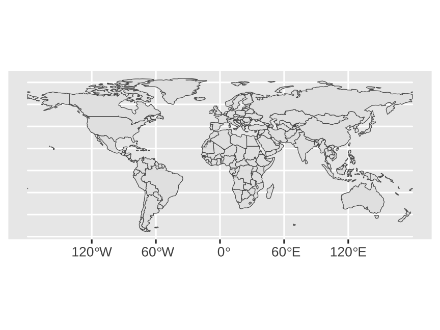 ] --- # Changing projections Use `coord_sf()` to change projections (see end for background on projections) .left-code[ ``` r world_shapes |> ggplot() + geom_sf() + * coord_sf(crs = "+proj=merc") ``` ] .right-plot[ 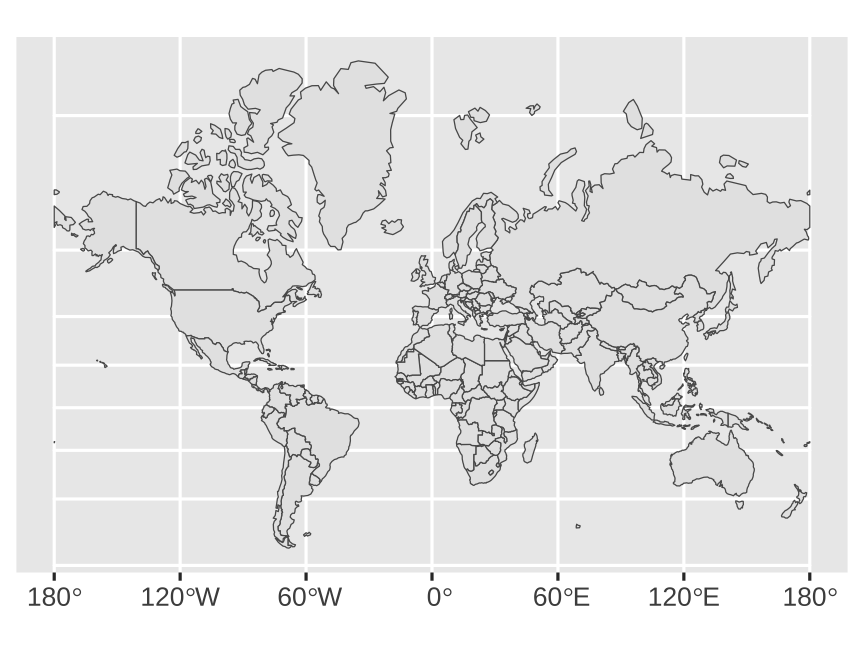 ] --- # Changing projections Use `coord_sf()` to change projections (see end for background on projections) .left-code[ ``` r world_shapes |> ggplot() + geom_sf() + * coord_sf(crs = "+proj=robin") ``` ] .right-plot[ 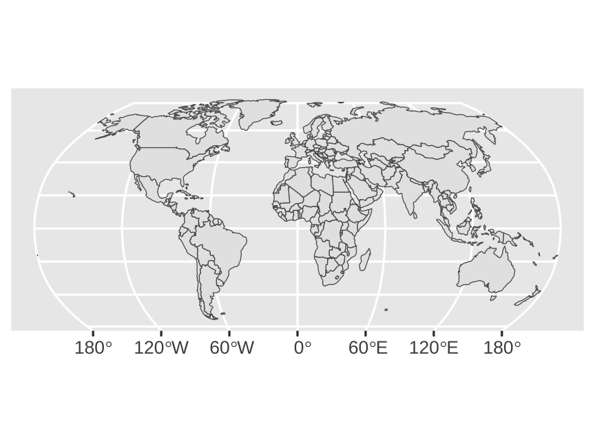 ] --- # Let's zoom in on New York .left-code[ ``` r # counties was created in the background head(counties, 5) ``` ``` ## Simple feature collection with 5 features and 1 field ## Geometry type: MULTIPOLYGON ## Dimension: XY ## Bounding box: xmin: -79 ymin: 41 xmax: -74 ymax: 43 ## Geodetic CRS: +proj=longlat +ellps=clrk66 +no_defs +type=crs ## county geom ## new york,albany albany MULTIPOLYGON (((-74 42, -74... ## new york,allegany allegany MULTIPOLYGON (((-78 42, -78... ## new york,bronx bronx MULTIPOLYGON (((-74 41, -74... ## new york,broome broome MULTIPOLYGON (((-75 42, -76... ## new york,cattaraugus cattaraugus MULTIPOLYGON (((-79 42, -79... ``` ``` r *counties |> * ggplot() + * geom_sf() ``` ] .right-plot[ 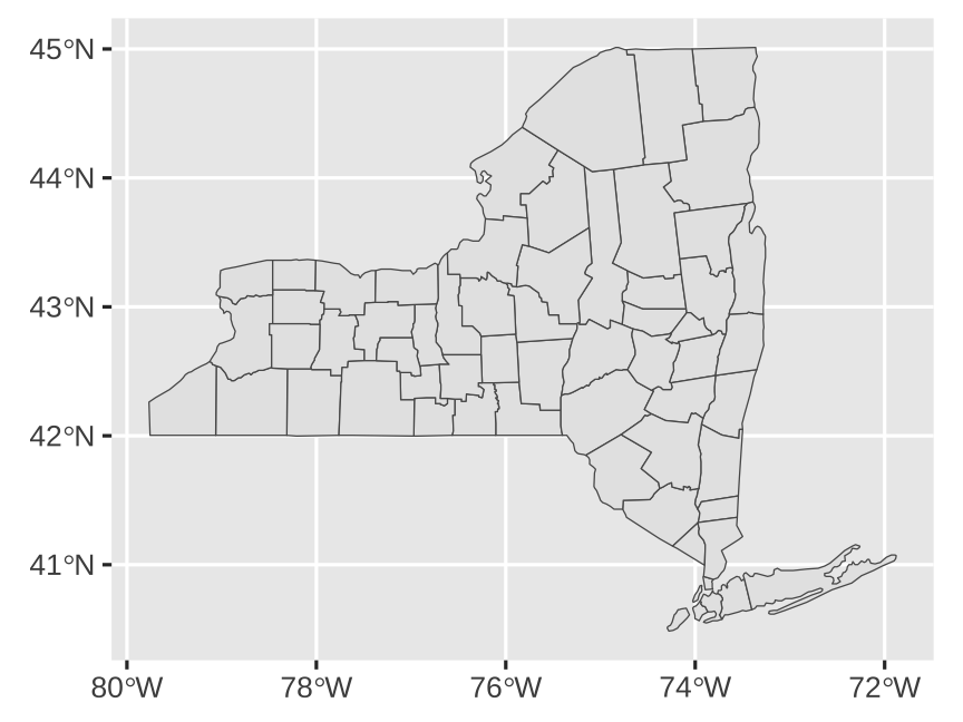 ] --- # We can filter like normal All regular data frame operations work on `sf` data frames .left-code[ ``` r counties |> * filter(county == "tompkins") |> ggplot() + geom_sf() ``` What will this code produce? ] -- .right-plot[ 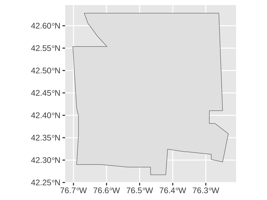 ] --- # We can mutate like normal All regular data frame operations work on `sf` data frames What will this code produce? ``` r counties |> * mutate(is_albany = (county=="albany")) |> head(5) ``` -- ``` ## Simple feature collection with 5 features and 2 fields ## Geometry type: MULTIPOLYGON ## Dimension: XY ## Bounding box: xmin: -79 ymin: 41 xmax: -74 ymax: 43 ## Geodetic CRS: +proj=longlat +ellps=clrk66 +no_defs +type=crs ## county geom is_albany ## new york,albany albany MULTIPOLYGON (((-74 42, -74... TRUE ## new york,allegany allegany MULTIPOLYGON (((-78 42, -78... FALSE ## new york,bronx bronx MULTIPOLYGON (((-74 41, -74... FALSE ## new york,broome broome MULTIPOLYGON (((-75 42, -76... FALSE ## new york,cattaraugus cattaraugus MULTIPOLYGON (((-79 42, -79... FALSE ``` --- # We can use aesthetics like normal All regular ggplot aesthetics work .left-code[ ``` r counties |> mutate(is_tompkins = (county=="tompkins")) |> * ggplot(aes(fill = is_tompkins)) + geom_sf() ``` What will this code produce? ] -- .right-plot[ 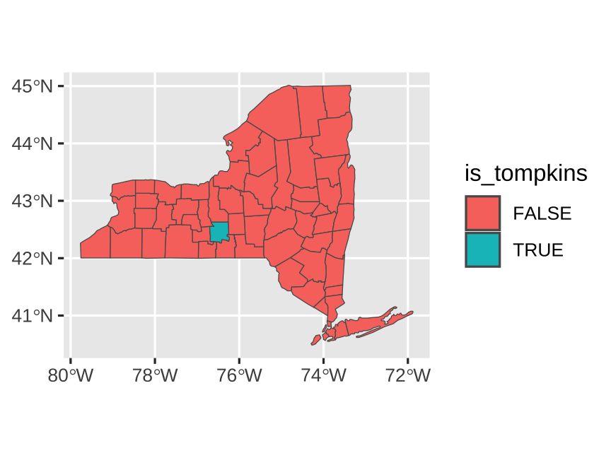 ] --- # We can add layers like normal All regular ggplot layers work .left-code[ ``` r counties |> mutate(is_tompkins = (county=="tompkins")) |> ggplot(aes(fill = is_tompkins)) + geom_sf() + * guides(fill = "none") + # omit legend * scale_fill_viridis_d() + # nicer colors * theme_minimal() # cleaner theme ``` What will this code produce? ] -- .right-plot[ 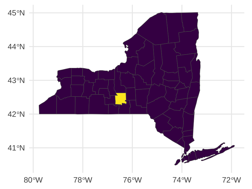 ] --- # We can do a lot more! `sf` is for all GIS stuff -- Draw maps -- Calculate distances between points -- Count observations in a given area -- Anything else related to geography! -- See [here](https://bookdown.org/robinlovelace/geocompr/intro.html) or [here](https://bookdown.org/lexcomber/brunsdoncomber2e/Ch5.html) for full textbooks --- # Example: compute the area of NY counties ``` r counties |> * mutate(area = st_area(counties)) # sf::st_area() computes areas of spatial geometries ``` ``` ## Simple feature collection with 62 features and 2 fields ## Geometry type: MULTIPOLYGON ## Dimension: XY ## Bounding box: xmin: -80 ymin: 40 xmax: -72 ymax: 45 ## Geodetic CRS: +proj=longlat +ellps=clrk66 +no_defs +type=crs ## First 10 features: ## county geom area ## new york,albany albany MULTIPOLYGON (((-74 42, -74... 1.4e+09 [m^2] ## new york,allegany allegany MULTIPOLYGON (((-78 42, -78... 2.6e+09 [m^2] ## new york,bronx bronx MULTIPOLYGON (((-74 41, -74... 7.3e+07 [m^2] ## new york,broome broome MULTIPOLYGON (((-75 42, -76... 1.8e+09 [m^2] ## new york,cattaraugus cattaraugus MULTIPOLYGON (((-79 42, -79... 3.4e+09 [m^2] ## new york,cayuga cayuga MULTIPOLYGON (((-77 43, -77... 1.9e+09 [m^2] ## new york,chautauqua chautauqua MULTIPOLYGON (((-79 43, -79... 2.8e+09 [m^2] ## new york,chemung chemung MULTIPOLYGON (((-77 42, -77... 1.1e+09 [m^2] ## new york,chenango chenango MULTIPOLYGON (((-75 43, -75... 2.3e+09 [m^2] ## new york,clinton clinton MULTIPOLYGON (((-74 45, -73... 2.9e+09 [m^2] ``` --- # Fill counties by area .left-code[ ``` r counties |> * mutate( * area = as.numeric(st_area(counties)) * ) |> * ggplot(aes(fill = area)) + geom_sf() + scale_fill_viridis_c() + theme_minimal() ``` ] .right-plot[ 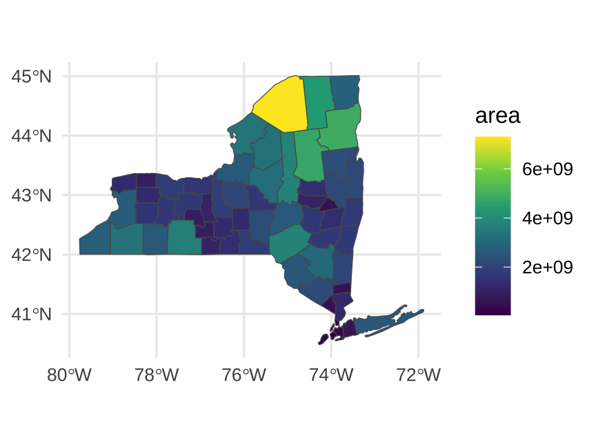 ] --- # Convert existing data to `sf` format .less-left.small-code[ No `geometry` column? ``` r # tibble creates data frames other_data <- tibble( city = c("Cornell", "Cancun"), long = c(-76.475266, -86.84656), lat = c(42.454323, 21.17429) ) # print our data frame other_data ``` ``` ## # A tibble: 2 × 3 ## city long lat ## <chr> <dbl> <dbl> ## 1 Cornell -76.5 42.5 ## 2 Cancun -86.8 21.2 ``` ] -- .more-right.small-code[ Make your own with `st_as_sf()`! ``` r other_data |> * st_as_sf( * coords = c("long", "lat"), # cols with coordinates * crs = st_crs("EPSG:4326") # coordinate ref. system * ) ``` ``` ## Simple feature collection with 2 features and 1 field ## Geometry type: POINT ## Dimension: XY ## Bounding box: xmin: -87 ymin: 21 xmax: -76 ymax: 42 ## Geodetic CRS: WGS 84 ## # A tibble: 2 × 2 ## city geometry ## * <chr> <POINT [°]> ## 1 Cornell (-76 42) ## 2 Cancun (-87 21) ``` ] --- # Compute the distance from Cornell to Cancun Compute distances using `st_distance()` ``` r other_sf <- other_data |> st_as_sf( coords = c("long", "lat"), crs = st_crs("EPSG:4326") ) other_sf |> * st_distance() ``` ``` ## Units: [m] ## [,1] [,2] ## [1,] 0 2556310 ## [2,] 2556310 0 ``` The distance from Cornell to Cancun is 2556 kilometers, or 1588 miles. --- # Let's map Cornell and Cancun .left-code[ ``` r world_shapes |> rename(code = GU_A3) |> # (country code) filter(code %in% c("CAN", "MEX", "USA")) |> ggplot() + geom_sf() + coord_sf(crs = "+proj=robin") ``` How could we add points for Cornell and Cancun to this map? ] .right-plot[  ] ??? Or to make great circle plots: https://www.findingyourway.io/blog/2018/02/28/2018-02-28_great-circles-with-sf-and-leaflet/ --- # Let's map Cornell and Cancun .left-code[ ``` r world_shapes |> rename(code = GU_A3) |> # (country code) filter(code %in% c("CAN", "MEX", "USA")) |> ggplot() + geom_sf() + * geom_sf( * data = other_sf, * color = "#B31B1B" * ) + coord_sf(crs = "+proj=robin") ``` Two ways to do this: 1. Add a `geom_sf` using `other_sf` 2. Bind `world_shapes` and `other_sf` first, then plot ] .right-plot[ 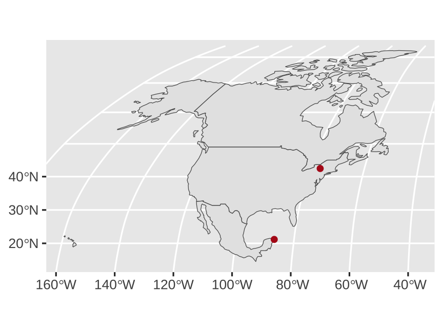 ] ??? Or to make great circle plots: https://www.findingyourway.io/blog/2018/02/28/2018-02-28_great-circles-with-sf-and-leaflet/ --- # `geom_sf()` is today’s standard You'll sometimes find older tutorials and StackOverflow answers about using `geom_map()` or **ggmap** or other things -- Those still work, but they don't use the same magical **sf** system with easy-to-convert projections and other GIS stuff -- Stick with **sf** and `geom_sf()` and your life will be easy --- # Where to find shapefiles -- [Natural Earth](https://www.naturalearthdata.com/) for international maps -- [US Census Bureau](https://www.census.gov/geographies/mapping-files/time-series/geo/carto-boundary-file.html) for US maps -- For anything else… -- .center[ <figure> <img src="img/11/shapefile-search.png" alt="Search for shapefiles" title="Search for shapefiles" width="65%"> </figure> ] --- class: inverse, center, middle name: projections # A quick primer on projections --- # A quick primer on projections [All world maps are wrong according to Vox](https://www.youtube.com/watch?v=kIID5FDi2JQ). Why? -- Impossible to represent a spherical surface as a plane without distortions -- Projections "project" 3D surface down to 2D -- Some preserve land shape, some preserve size, etc. -- Let's look at some examples --- # World projections <img src="11-slides_files/figure-html/projections-1.png" width="100%" style="display: block; margin: auto;" /> --- # US projections <img src="11-slides_files/figure-html/us-projections-1.png" width="100%" style="display: block; margin: auto;" /> --- # Which projection is best? -- None of them -- There are no good or bad projections -- There are good and bad projections for a particular use case --- # Reference: Finding projection codes [spatialreference.org](https://spatialreference.org/ref/epsg/) [epsg.io](https://epsg.io/) [proj.org](https://proj.org/operations/projections/index.html) .small[[This](https://www.earthdatascience.org/courses/earth-analytics/spatial-data-r/understand-epsg-wkt-and-other-crs-definition-file-types/) is an excellent overview of how this all works] .small[And [this](https://web.archive.org/web/20200225021219/https://www.nceas.ucsb.edu/~frazier/RSpatialGuides/OverviewCoordinateReferenceSystems.pdf) is a really really helpful overview of all these moving parts] --- # Scales .pull-left-3[ <figure> <img src="img/11/download_thumbs_10m.jpg" alt="10m scale" title="10m scale" width="100%"> </figure> .small.center[1:10m = 1:10,000,000] .small.center[1 cm = 100 km] ] .pull-middle-3[ <figure> <img src="img/11/download_thumbs_50m.jpg" alt="50m scale" title="50m scale" width="100%"> </figure> .small.center[1:50m = 1:50,000,000] .small.center[ 1cm = 500 km] ] .pull-right-3[ <figure> <img src="img/11/download_thumbs_110m.jpg" alt="110m scale" title="110m scale" width="100%"> </figure> .small.center[1:110m = 1:110,000,000] .small.center[1 cm = 1,100 km] ] -- Using too high of a resolution makes your maps slow and huge