class: center, middle # Time .class-info[ **Week 9** AEM 2850 / 5850 : R for Business Analytics<br> Cornell Dyson<br> Fall 2025 Acknowledgements: [Andrew Heiss](https://datavizm20.classes.andrewheiss.com) ] --- # Announcements **Prelim 1 regrade requests due this Thursday, October 23** **Group projects will be due Friday, November 14** (not Nov 7!) - **Instructions will be posted on canvas tomorrow** - **We will post group member updates by tomorrow** (as needed) - We will set up group-specific workspaces on posit cloud by Thursday - Note: we have encountered some issues with overwriting work in the past - Save your work early and often to avoid overwriting each other's work - We recommend backing up your individual code whenever you stop work - Use a collaborative editing platform like google docs for your code - Make a plan and start early! -- Questions before we get started? --- # Plan for this week .pull-left[ ### Tuesday - [Prologue](#prologue) - [Visualizing time: the basics](#visualizing-time-basics) - [Visualizing amounts over time](#visualizing-amounts) - [Dates and times in R](#working-with-time) - [Start example-09](#example-start) ] .pull-right[ ### Thursday - [Visualizing time: leveling up](#visualizing-time-advanced) - [Faceting plots](#faceting) - [Animating plots](#animations) - [Finish example-09](#example-finish) <br> ] ### Reference slides at end of deck: - [Visualizing distributions over time](#visualizing-distributions) - [Starting, ending, and decomposing time](#decomposing) --- name: prologue class: inverse, center, middle name: prologue # Prologue --- # [Car thefts are rising. Is TikTok to blame?](https://usafacts.org/data-projects/car-thefts) <figure> <img src="img/09/car-thefts-tiktok.png" alt="Car thefts over time, form USA Facts" title="Car thefts are rising. Is a TikTok challenge to blame?" width="100%"> </figure> What's good about this graph? What could be better? ??? Source: https://usafacts.org/data-projects/car-thefts --- # What's good? What could be better? .center[ <figure> <img src="img/09/baby-names.gif" alt="Graph of the number of baby names that end in i in the U.S. from 1900 to 2016" title="Baby names that end in i" width="65%"> </figure> ] ??? Source: https://statmodeling.stat.columbia.edu/2023/01/26/labeling-the-x-and-y-axes-heres-a-quick-example-where-a-bit-of-care-can-make-a-big-difference/ --- # What's good? What could be better? .pull-left[ - Stacked curves makes it hard to see trends for females - Legend could be bigger and use "Male" and "Female" - x-axis labeling: use labels every 10 or 20 years (not 4!) - y-axis labeling: - multiples of 4 are not intuitive - %s would be easier to interpret ] .pull-right[ <figure> <img src="img/09/baby-names.gif" alt="Graph of the number of baby names that end in i in the U.S. from 1900 to 2016" title="Baby names that end in i" width="100%"> </figure> ] ??? Source: https://statmodeling.stat.columbia.edu/2023/01/26/labeling-the-x-and-y-axes-heres-a-quick-example-where-a-bit-of-care-can-make-a-big-difference/ --- name: axis-issues # Is truncating the y-axis misleading? <img src="09-slides_files/figure-html/truncation-yes-no-1.png" width="864" style="display: block; margin: auto;" /> --- # Don't be too extreme! When discussing amounts, we said to never truncate the y-axis But it is actually more legal to truncate the y-axis than you might think When do you think it is okay to truncate? -- - When small movements matter -- - When the scale itself is distorted -- - When zero values are impossible --- # When is it okay to truncate? .center[**When small movements matter**] .pull-left[ <figure> <img src="img/09/us_gdp_us_gdp_chartbuilder-3.png" alt="GDP not truncated, from Quartz" title="GDP not truncated, from Quartz" width="100%"> </figure> ] -- .pull-right[ <figure> <img src="img/09/us_gdp_us_gdp_chartbuilder-2.png" alt="GDP truncated, from Quartz" title="GDP truncated, from Quartz" width="100%"> </figure> ] ??? Stock prices too https://qz.com/418083/its-ok-not-to-start-your-y-axis-at-zero/ --- # When is it okay to truncate? .center[**When the scale itself is distorted**] .pull-left.center[ <figure> <img src="img/09/uber-sign.jpg" alt="Sign in an Uber car about rating system" title="Sign in an Uber car about rating system" width="70%"> </figure> ] -- .pull-right.center[ <figure> <img src="img/09/uber-scale.jpg" alt="Internal rating system at Uber" title="Internal rating system at Uber" width="100%"> </figure> ] ??? https://www.buzzfeed.com/carolineodonovan/the-fault-in-five-stars http://www.businessinsider.com/leaked-charts-show-how-ubers-driver-rating-system-works-2015-2 --- # When is it okay to truncate? .center[**When zero values are impossible**] .pull-left[ <figure> <img src="img/09/oral_temperature_sara_bob_chartbuilder.png" alt="Temperature not truncated, from Quartz" title="Temperature not truncated, from Quartz" width="100%"> </figure> ] -- .pull-right[ <figure> <img src="img/09/oral_temperature_sara_bob_chartbuilder-1.png" alt="Temperature truncated, from Quartz" title="Temperature truncated, from Quartz" width="100%"> </figure> ] ??? https://qz.com/418083/its-ok-not-to-start-your-y-axis-at-zero/ --- # Never on bar charts! .center[ <figure> <img src="img/07/obamacareenrollment-fncchart.jpg" alt="Fox News Obamacare enrollment" title="Fox News Obamacare enrollment" width="85%"> </figure> ] --- # Zero is okay, too Just because you don't *have to* start at 0 doesn't mean you should *never* start at 0 Andrew Gelman's heuristic: **"If zero is in the neighborhood, invite it in."** .center[ <figure> <img src="img/09/zero-in-the-neighborhood.png" alt="If zero is in the neighborhood, invite it in" title="If zero is in the neighborhood, invite it in" width="90%"> </figure> ] ??? https://statmodeling.stat.columbia.edu/2021/12/17/graphing-advice-if-zero-is-in-the-neighborhood-invite-it-in/ --- # Keep date scales consistent, flag missing data .center[ <figure> <img src="img/09/08fig21.jpg" alt="Good and bad treatment of missing values in x-axis" title="Good and bad treatment of missing values in x-axis" width="100%"> </figure> ] ??? Alberto Cairo, *The Truthful Art*, chapter 8, figure 8.21 --- # Aside: don’t impute across categories .pull-left[ <img src="09-slides_files/figure-html/likert-imputation-bad-1.png" width="100%" style="display: block; margin: auto;" /> ] -- .pull-right[ <img src="09-slides_files/figure-html/likert-good-1.png" width="100%" style="display: block; margin: auto;" /> ] --- class: inverse, center, middle name: visualizing-time-basics # Visualizing time: the basics --- name: visualizing-amounts # Visualizing amounts over time Time is just a variable that can be mapped to an aesthetic -- Can be used as `x`, `y`, `color`, `fill`, `facet`, and even animation -- Can use all sorts of `geom`s: lines, columns, points, heatmaps, densities, maps, etc. -- In general, follow reading conventions to show time progression: → & ↓ --- # Visualizing amounts over time using ggplot Let's use GameStop share prices to make some plots: ``` r gme_prices ``` ``` ## # A tibble: 5,060 × 8 ## symbol date open high low close volume adjusted ## <chr> <date> <dbl> <dbl> <dbl> <dbl> <dbl> <dbl> ## 1 GME 2002-02-13 9.62 10.1 9.52 10.0 19054000 6.77 ## 2 GME 2002-02-14 10.2 10.2 9.93 10 2755400 6.73 ## 3 GME 2002-02-15 10 10.0 9.85 9.95 2097400 6.70 ## 4 GME 2002-02-19 9.9 9.9 9.38 9.55 1852600 6.43 ## 5 GME 2002-02-20 9.6 9.88 9.52 9.88 1723200 6.65 ## 6 GME 2002-02-21 9.84 9.93 9.75 9.85 1744200 6.63 ## 7 GME 2002-02-22 9.93 9.93 9.6 9.68 881400 6.51 ## 8 GME 2002-02-25 9.65 9.82 9.54 9.75 863400 6.56 ## 9 GME 2002-02-26 9.7 9.85 9.54 9.75 690400 6.56 ## 10 GME 2002-02-27 9.68 9.68 9.5 9.57 1022800 6.45 ## # ℹ 5,050 more rows ``` How would you use these data to plot `adjusted` prices over time? --- # Time on x-axis + `geom_point()` .left-code[ ``` r gme_prices |> ggplot(aes(x = date, y = adjusted)) + geom_point() + labs( x = NULL, y = "Share price ($)", title = "GME to the moon" ) ``` How could you reduce point overlap? ] .right-plot[  ] --- # Time on x-axis + `geom_point()` .left-code[ ``` r gme_prices |> ggplot(aes(x = date, y = adjusted)) + * geom_point(size = 0.5) + labs( x = NULL, y = "Share price ($)", title = "GME to the moon" ) ``` How could you add a line to this? ] .right-plot[  ] --- # Time on x-axis + `geom_point()` .left-code[ ``` r gme_prices |> ggplot(aes(x = date, y = adjusted)) + geom_point(size = 0.5) + * geom_line() + labs( x = NULL, y = "Share price ($)", title = "GME to the moon" ) ``` Which is better, points or lines? ] .right-plot[  ] --- # Time on x-axis: points vs lines Which is better? -- It depends! -- **Points emphasize observations** **Lines emphasize trends** Using lines for time series data is common since data are evenly spaced and usually complete But lines are effectively made-up data, so be careful how you use them! --- # Time on x-axis + `geom_line()` The GameStop share price plot is clearer without points: .left-code[ ``` r gme_prices |> ggplot(aes(x = date, y = adjusted)) + * geom_line() + labs( x = NULL, y = "Share price ($)", title = "GME to the moon" ) ``` ] .right-plot[  ] --- # Line plots don't have to be boring .more-left.center[ <img src="09-slides_files/figure-html/covid-unemp-claims-1.png" width="100%" style="display: block; margin: auto;" /> ] .less-right.center[ <figure> <img src="img/09/nyt_2020-05-09.jpg" alt="Front page of the NYT, May 9, 2020" title="Front page of the NYT, May 9, 2020" width="90%"> </figure> ] ??? Monthly change in jobs since end of WWII The New York Times front page, May 9, 2020 https://www.nytimes.com/issue/todayspaper/2020/05/09/todays-new-york-times https://static01.nyt.com/images/2020/05/09/nytfrontpage/scan.pdf --- class: inverse, center, middle name: working-with-time # Dates and times in R --- # Are dates and times special? We just made some plots without really thinking about data types We can map "dates" to x regardless of whether they are `date` or `numeric` objects When do we need to pay attention to the details? -- 1. Converting from strings to dates -- 2. Getting components of date-time data -- 3. Computing time spans --- # Dates and times in R R has "native" classes for storing calendar dates and times - For background, see `?Dates` and `?DateTimeClasses` -- The `lubridate` package offers convenient tools for working with dates and times - Loaded automatically as part of the core tidyverse since tidyverse 2.0.0 - See [Chapter 17 of R4DS (2e)](https://r4ds.hadley.nz/datetimes.html) --- # Converting from strings to dates Use `lubridate::ymd` to parse dates with **y**ear, **m**onth, and **d**ay components ``` r svb_failure <- ymd("2023-03-10") svb_failure ``` ``` ## [1] "2023-03-10" ``` -- .pull-left[ ``` r class("2023-03-10") ``` ``` ## [1] "character" ``` ] .pull-right[ ``` r class(svb_failure) ``` ``` ## [1] "Date" ``` ] --- # Converting from strings to dates `lubridate` offers many other functions for parsing dates For example, instead of `ymd` we could use `mdy`: ``` r signature_failure <- mdy("March 12, 2023") ``` .pull-left[ ``` r signature_failure ``` ``` ## [1] "2023-03-12" ``` ] .pull-right[ ``` r class(signature_failure) ``` ``` ## [1] "Date" ``` ] --- # Getting components of date-time data What year did Silicon Valley Bank fail? -- ``` r year(svb_failure) ``` ``` ## [1] 2023 ``` -- .pull-left[ What day of the week was that? ``` r wday(svb_failure) ``` ``` ## [1] 6 ``` ``` r wday(svb_failure, label = TRUE) ``` ``` ## [1] Fri ## Levels: Sun < Mon < Tue < Wed < Thu < Fri < Sat ``` ] -- .pull-right[ What month was that? ``` r month(svb_failure) ``` ``` ## [1] 3 ``` ``` r month(svb_failure, label = TRUE) ``` ``` ## [1] Mar ## 12 Levels: Jan < Feb < Mar < Apr < May < Jun < Jul < Aug < Sep < ... < Dec ``` ] --- # Computing time spans How many days passed between the failures of SVB and Signature? ``` r signature_failure - svb_failure ``` ``` ## Time difference of 2 days ``` -- How many days are left until classes end? ``` r ymd(20251204) - today() ``` ``` ## Time difference of 44 days ``` -- These are **durations** See [Chapter 17 of R4DS (2e)](https://r4ds.hadley.nz/datetimes.html) for functions to compute **periods** and **intervals** --- class: inverse, center, middle name: example-start # example-09:<br>time-practice.R --- class: inverse, center, middle name: visualizing-time-advanced # Visualizing time: leveling up --- name: faceting # Faceting plots over time .center[ <figure> <img src="img/09/08fig30.jpg" alt="Map by Jorge Camões" title="Map by Jorge Camões" width="55%"> <figcaption>Map of the spread of Walmart by Jorge Camões</figcaption> </figure> ] ??? Alberto Cairo, *The Truthful Art*, chapter 8, figure 8.30 --- name: animations # Animating plots over time .center[ <figure> <img src="img/09/my-gapminder-animation.gif" alt="My Hans Rosling animation" title="My Hans Rosling animation" width="70%"> </figure> ] --- # How can we make this animation in R? First, how would we make a static plot of the data? -- .left-code[ ``` r library(gapminder) # gapminder data gapminder |> * ggplot(aes(x = gdpPercap, y = lifeExp, * size = pop, color = continent)) + geom_point(alpha = 0.5, show.legend = FALSE) ``` ] .right-plot[  ] ??? https://towardsdatascience.com/how-to-create-animated-plots-in-r-adf53a775961 --- # How can we make this animation in R? Let's clean this up a bit to match the gapminder formatting: .left-code[ ``` r library(gapminder) # gapminder data gapminder |> ggplot(aes(x = gdpPercap, y = lifeExp, size = pop, color = continent)) + geom_point(alpha = 0.5, show.legend = FALSE) + * scale_color_manual( * values = gapminder::continent_colors * ) + * scale_x_log10(labels = label_dollar()) + * scale_size_continuous(range = c(1, 15)) + theme_classic(base_size = 20) + labs(x = "GDP per capita", y = "Life expectancy", title = "Year: 1952-2007") ``` ] .right-plot[ 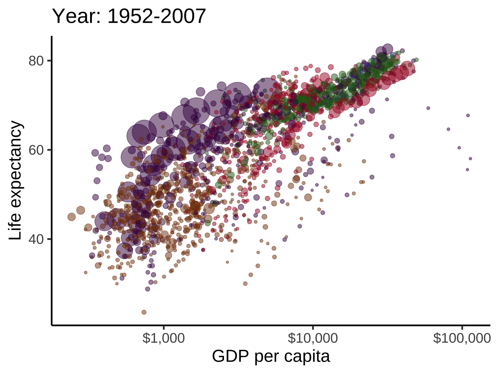 ] ??? https://towardsdatascience.com/how-to-create-animated-plots-in-r-adf53a775961 --- # Converting a static plot to an animation Second, let's use `gganimate` to visualize changes over time .left-code[ ``` r *library(gganimate) # plot animation package gapminder |> ggplot(aes(x = gdpPercap, y = lifeExp, size = pop, color = continent)) + geom_point(alpha = 0.5, show.legend = FALSE) + scale_color_manual( values = gapminder::continent_colors ) + scale_x_log10(labels = label_dollar()) + scale_size_continuous(range = c(1, 15)) + theme_classic(base_size = 20) + labs(x = "GDP per capita", y = "Life expectancy", * title = "Year: {frame_time}") + * transition_time(year) + * ease_aes('linear') # default progression ``` ] -- .right-plot[ 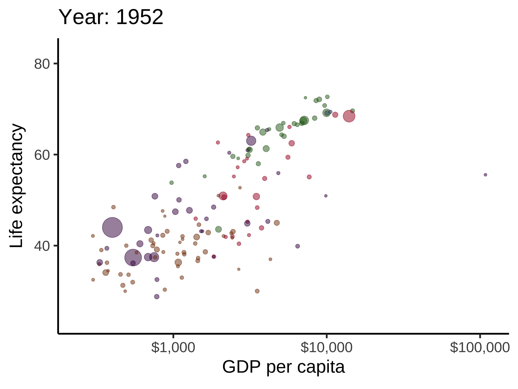 ] ??? https://towardsdatascience.com/how-to-create-animated-plots-in-r-adf53a775961 --- # Saving gifs Third, use `anim_save()` to write a `.gif` that you can text to your mom ``` r library(gganimate) library(gifski) my_gapminder_animation <- gapminder |> ggplot(aes(x = gdpPercap, y = lifeExp, size = pop, color = continent)) + geom_point(alpha = 0.5, show.legend = FALSE) + scale_color_manual(values = gapminder::continent_colors) + scale_x_log10(labels = label_dollar()) + scale_size_continuous(range = c(1, 15)) + theme_classic(base_size = 20) + labs(x = "GDP per capita", y = "Life expectancy", title = "Year: {frame_time}") + transition_time(year) + ease_aes('linear') *animate(my_gapminder_animation, renderer = gifski_renderer()) *anim_save("content/slides/img/09/my-gapminder-animation.gif") ``` ??? https://towardsdatascience.com/how-to-create-animated-plots-in-r-adf53a775961 --- class: inverse, center, middle name: example-finish # example-09:<br>time-practice.R --- class: inverse, center, middle name: visualizing-distributions # Visualizing distributions over time <br> (for reference) --- # Visualizing distributions over time We can also visualize how distributions evolve. How could you make this plot? <img src="09-slides_files/figure-html/density-ridges-1.png" width="90%" style="display: block; margin: auto;" /> --- # Let's start simple .left-code[ ``` r *library(ggridges) # for geom_density_ridges() gapminder |> * mutate(year = as_factor(year)) |> ggplot(aes( x = lifeExp, * y = year # map time to y )) + * geom_density_ridges() # add geom ``` How could we modify this to follow ↓ convention for time? ] .right-plot[ 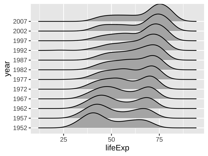 ] --- # Follow ↓ convention for time .left-code[ ``` r gapminder |> mutate(year = as_factor(year)) |> ggplot(aes( x = lifeExp, * y = fct_rev(year) # reverse year )) + geom_density_ridges() ``` How could we make the lines white? ] .right-plot[ 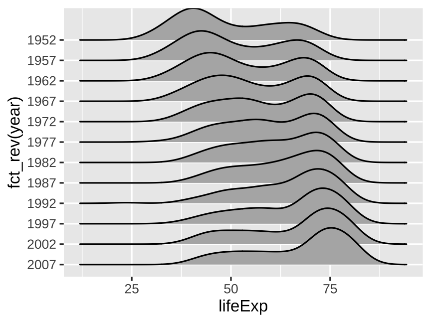 ] --- # Add color to help visually separate densities .left-code[ ``` r gapminder |> mutate(year = as_factor(year)) |> ggplot(aes( x = lifeExp, y = fct_rev(year) )) + geom_density_ridges( * color = "white", # separate densities fill = "#B31B1B" ) ``` How could we add a line at the median of each density? ] .right-plot[  ] --- # Add a line at the median of each density .left-code[ ``` r gapminder |> mutate(year = as_factor(year)) |> ggplot(aes( x = lifeExp, y = fct_rev(year) )) + geom_density_ridges( color = "white", fill = "#B31B1B", * quantile_lines = TRUE, # add lines * quantiles = 2 # median ) ``` ] .right-plot[  ] --- # Finish by cleaning the plot up .left-code[ ``` r gapminder |> mutate(year = as_factor(year)) |> ggplot(aes( x = lifeExp, y = fct_rev(year) )) + geom_density_ridges( color = "white", fill = "#B31B1B", quantile_lines = TRUE, quantiles = 2 ) + * labs( * x = "Life expectancy",# modify label * y = NULL # omit labels * ) + * theme_minimal( # cleaner theme * base_size = 14 # larger font * ) ``` ] .right-plot[  ] --- class: inverse, center, middle name: decomposing # Starting, ending, and decomposing time <br> (for reference) --- # You have to start (and end) somewhere You always have to choose start and end points Start and end at reasonable times that help maintain the context of your story --- # Measles vaccine was pretty effective <img src="09-slides_files/figure-html/measles-partial-1.png" width="75%" style="display: block; margin: auto;" /> ??? Data sources listed here: https://commons.m.wikimedia.org/wiki/File:Measles_US_1938-2019.png I used [this big PDF table from the CDC](https://web.archive.org/web/20190120205018/https://www.cdc.gov/vaccines/pubs/pinkbook/downloads/appendices/e/reported-cases.pdf), used some random online PDF → CSV converter, and cleaned up the data by hand in Excel: --- # Measles vaccine was *incredible*! <img src="09-slides_files/figure-html/measles-full-1.png" width="75%" style="display: block; margin: auto;" /> --- # Seasonality Don't mistake seasonality for actual trends .pull-left[ <img src="09-slides_files/figure-html/seasonality-zoomed-in-1.png" width="100%" style="display: block; margin: auto;" /> ] -- .pull-right[ <img src="09-slides_files/figure-html/seasonality-zoomed-out-1.png" width="100%" style="display: block; margin: auto;" /> ] --- # Seasonal adjustment <img src="09-slides_files/figure-html/retail-decomposition-1.png" width="65%" style="display: block; margin: auto;" /> --- # Birthday decomposition .center[ <figure> <img src="img/09/bda_cover.png" alt="Bayesian Data Analysis cover" title="Bayesian Data Analysis cover" width="54%"> </figure> ] ??? Source: http://www.stat.columbia.edu/~gelman/book/