class: center middle main-title section-title-4 # Distributions .class-info[ **Week 8** AEM 2850 / 5850 : R for Business Analytics<br> Cornell Dyson<br> Fall 2025 Acknowledgements: [Andrew Heiss](https://datavizm20.classes.andrewheiss.com), [Claus Wilke](https://wilkelab.org/SDS375/) <!-- [Grant McDermott](https://github.com/uo-ec607/lectures), --> <!-- [Jenny Bryan](https://stat545.com/join-cheatsheet.html), --> <!-- [Allison Horst](https://github.com/allisonhorst/stats-illustrations) --> ] --- # Announcements Welcome back from Fall Break! -- Prelim 1 grades will be released on this afternoon The average grade was 74%. Great work -- it was a tough prelim! -- **I plan to curve final letter grades** so that the average is in the B+ to A- range Please see the canvas announcement and gradescope for more information **We will accept regrade requests through Thursday, October 23** -- _**Please**_ see me if you are concerned about your ability to succeed in this course --- # Announcements We will provide details on the group project soon -- Questions before we get started? --- # Plan for this week .pull-left[ ### Tuesday - *Fall Break: No class on Oct 14* ] .pull-right[ ### Thursday - [Distributions](#distributions) - [example-08-2](#example-2) ] --- class: inverse, center, middle name: distributions # Distributions --- # Problems with single numbers .pull-left[ <img src="08-slides_files/figure-html/animal-weight-bar-1.png" width="100%" style="display: block; margin: auto;" /> ] .pull-right[ <img src="08-slides_files/figure-html/animal-weight-points-1.png" width="100%" style="display: block; margin: auto;" /> ] --- # More information is (almost) always better **Avoid visualizing single numbers when you have a whole range or distribution of numbers** -- Uncertainty in single variables Uncertainty across multiple variables Uncertainty in models and simulations -- **What are some common methods for visualizing distributions?** -- Histograms, densities, box plots --- # Histograms What are they? -- Put data into equally spaced buckets (or "bins") based on values of a variable, plot how many rows of the data frame are in each bucket --- # Histograms How would we use the grammar of graphics to make a histogram of `lifeExp`? ``` r library(gapminder) gapminder_2002 <- gapminder |> filter(year == 2002) head(gapminder_2002) ``` ``` ## # A tibble: 6 × 6 ## country continent year lifeExp pop gdpPercap ## <fct> <fct> <int> <dbl> <int> <dbl> ## 1 Afghanistan Asia 2002 42.1 25268405 727. ## 2 Albania Europe 2002 75.7 3508512 4604. ## 3 Algeria Africa 2002 71.0 31287142 5288. ## 4 Angola Africa 2002 41.0 10866106 2773. ## 5 Argentina Americas 2002 74.3 38331121 8798. ## 6 Australia Asia 2002 80.4 19546792 30688. ``` --- # Histograms .left-code[ ``` r gapminder_2002 |> * ggplot(aes(x = lifeExp)) + * geom_histogram() ``` ] .right-plot[ 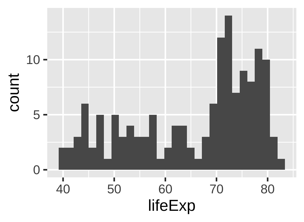 ] --- # Histograms: binwidth argument No official rule for what makes a good bin width .pull-left-3[ .center.small[Too narrow:] .center.tiny[`geom_histogram(binwidth = .2)`] <img src="08-slides_files/figure-html/hist-too-narrow-1.png" width="100%" style="display: block; margin: auto;" /> ] -- .pull-middle-3[ .center.small[Too wide:] .center.tiny[`geom_histogram(binwidth = 50)`] <img src="08-slides_files/figure-html/hist-too-wide-1.png" width="100%" style="display: block; margin: auto;" /> ] -- .pull-right-3[ .center.small[(One type of) just right:] .center.tiny[`geom_histogram(binwidth = 5)`] <img src="08-slides_files/figure-html/hist-just-right-1.png" width="100%" style="display: block; margin: auto;" /> ] --- # Histograms: tips using other arguments .pull-left[ .center[Add a border to the bars<br>for readability] .center.tiny[`geom_histogram(..., color = "white")`] <img src="08-slides_files/figure-html/hist-border-1.png" width="100%" style="display: block; margin: auto;" /> ] -- .pull-right[ .center.small[Set the boundary;<br>bucket now 50–55, not 47.5–52.5] .center.tiny[`geom_histogram(..., boundary = 50)`] <img src="08-slides_files/figure-html/hist-boundary-1.png" width="100%" style="display: block; margin: auto;" /> ] --- # Density plots What are they? -- Estimates of the **probability *density* function** of a random variable -- Histograms show raw counts; density plots show proportions (integrate to 1) -- How would we use the grammar of graphics to make a density plot of `lifeExp`? --- # Density plots .left-code[ ``` r gapminder_2002 |> ggplot(aes(x = lifeExp)) + * geom_density() ``` ] .right-plot[ 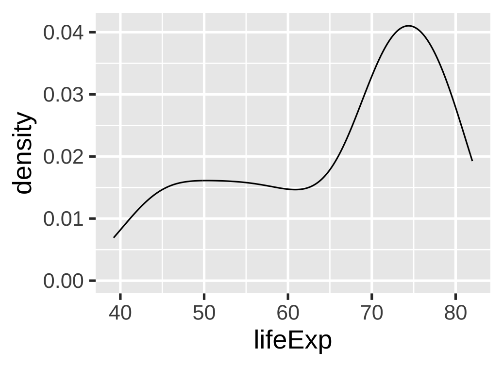 ] --- # Density plots: add some color .left-code[ ``` r gapminder_2002 |> ggplot(aes(x = lifeExp)) + * geom_density(fill = "skyblue") ``` We can use aesthetics as *parameters* inside a geom rather than inside an **aes()** statement Here we used **fill = "skyblue"** ] .right-plot[ 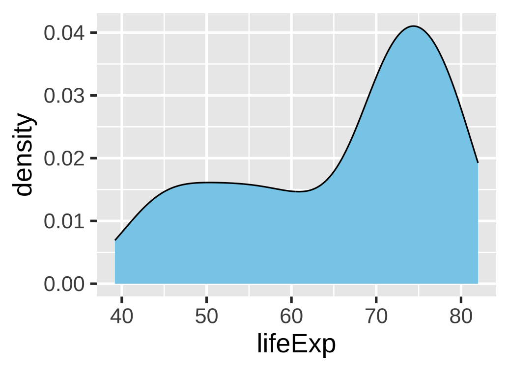 ] --- # Box and whisker plots What are they? -- Graphical representations of specific points in a distribution --- # Box and whisker plots <img src="08-slides_files/figure-html/boxplot-explanation-1.png" width="100%" style="display: block; margin: auto;" /> --- # Box and whisker plots What are they? Graphical representations of specific points in a distribution How could we use ggplot to make a boxplot of `lifeExp`? --- # Box and whisker plots .left-code[ ``` r gapminder_2002 |> ggplot(aes(x = lifeExp)) + * geom_boxplot() ``` What do the y axis numbers mean? ] .right-plot[ 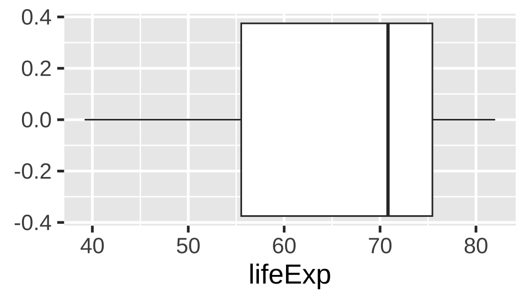 ] --- # Box and whisker plots Use `theme()` to customize the plot for this geom .left-code[ ``` r gapminder_2002 |> ggplot(aes(x = lifeExp)) + geom_boxplot() + * theme( * axis.text.y = element_blank(), * axis.ticks.y = element_blank(), * panel.grid.major.y = element_blank(), * panel.grid.minor.y = element_blank() * ) ``` ] .right-plot[ 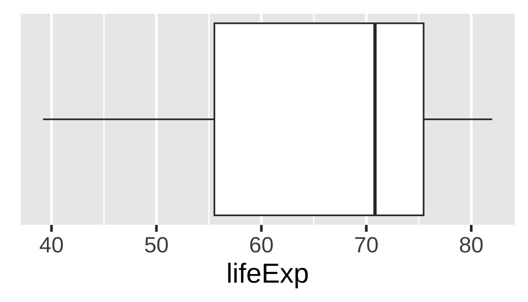 ] --- # Uncertainty across multiple variables How could we visualize the distribution of a single variable across groups? -- Add a `fill` aesthetic or use facets! --- # Multiple histograms Fill with a different variable .left-code[ ``` r gapminder_2002 |> ggplot(aes(x = lifeExp, * fill = continent)) + geom_histogram(binwidth = 5, color = "white", boundary = 50) + theme(legend.position = "bottom") + labs(fill = NULL) ``` This stacked histogram is bad and hard to read though ] .right-plot[ 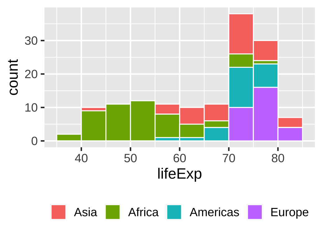 ] --- # Multiple histograms Facet with a different variable .left-code[ ``` r gapminder_2002 |> ggplot(aes(x = lifeExp, fill = continent)) + geom_histogram(binwidth = 5, color = "white", boundary = 50) + * facet_wrap(vars(continent)) + * guides(fill = "none") ``` Note: we could also omit<br>`fill = continent` ] .right-plot[ 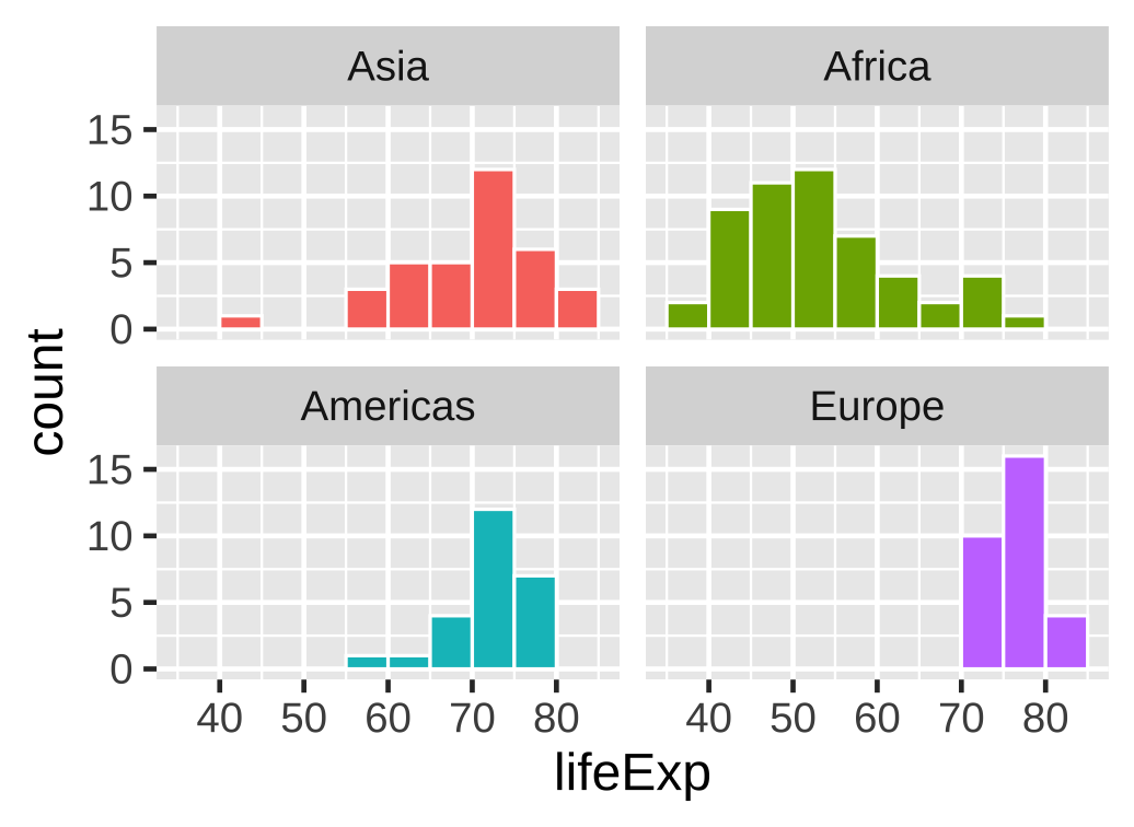 ] --- # Multiple densities: Transparency .left-code[ ``` r gapminder_2002 |> ggplot(aes(x = lifeExp, fill = continent)) + * geom_density(alpha = 0.5) + theme(legend.position = "bottom") + labs(fill = NULL) ``` But be careful, these can get confusing quickly With many groups, better to space them out using ridgeline plots ] .right-plot[ 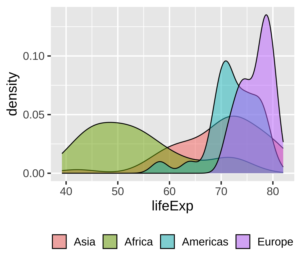 ] --- # Multiple densities: Ridgeline plots .left-code[ ``` r *library(ggridges) gapminder_2002 |> ggplot(aes(x = lifeExp, fill = continent, * y = continent)) + guides(fill = "none") + labs(y = NULL) + * geom_density_ridges() ``` There is no explicit scale for the densities anymore (it is shared with y) With many densities, use a single fill color to prevent distraction ] .right-plot[ 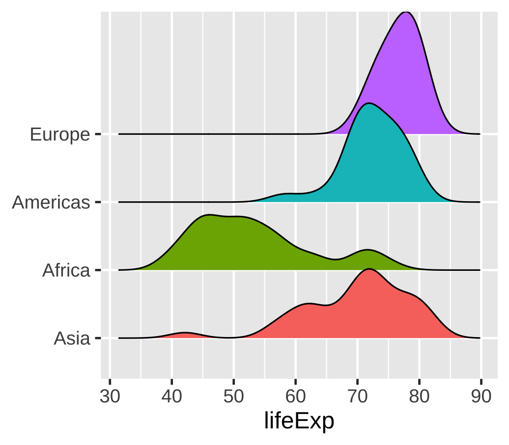 ] --- # Multiple box and whisker plots .left-code[ ``` r gapminder_2002 |> ggplot(aes( x = lifeExp, fill = continent, y = continent )) + guides(fill = "none") + labs(y = NULL) + * geom_boxplot() ``` ] .right-plot[ 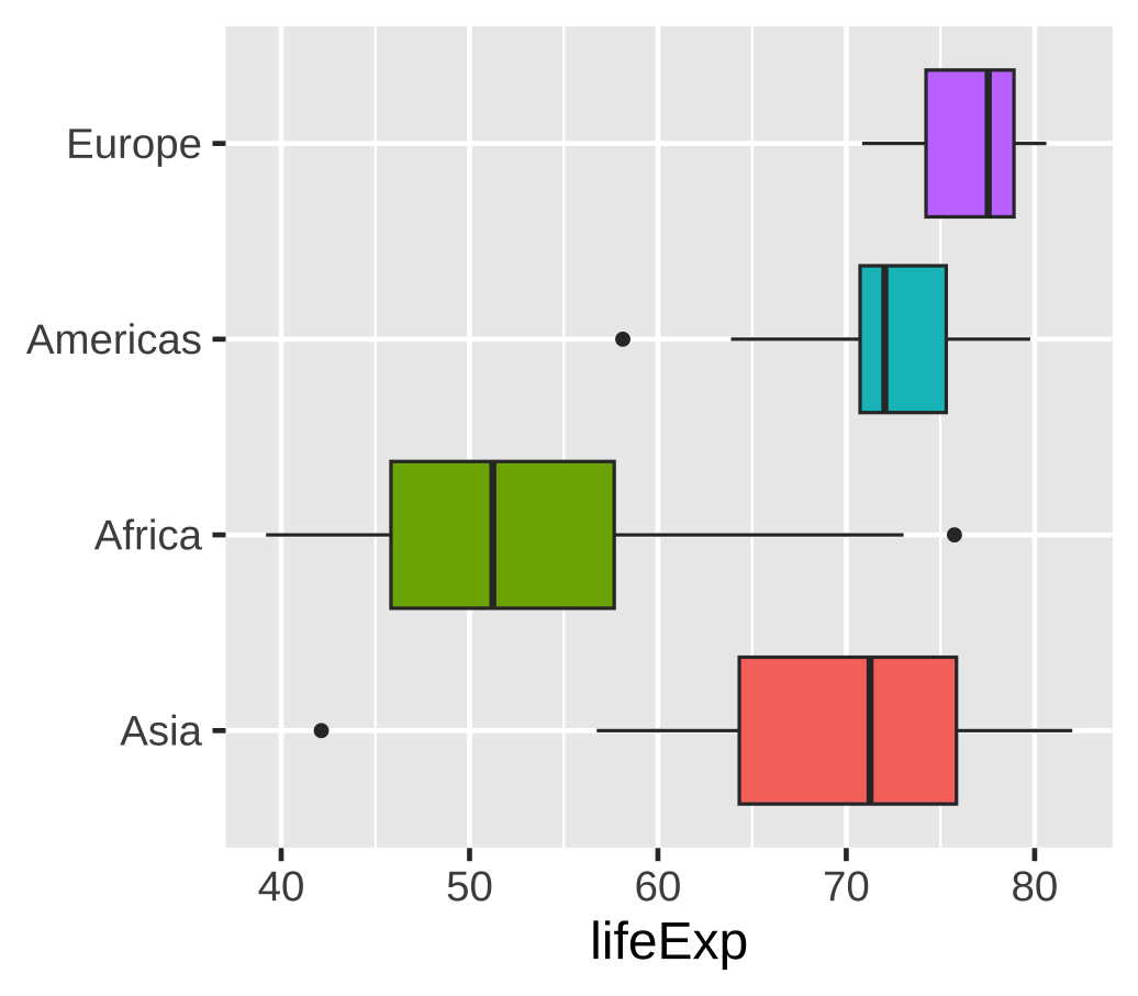 ] --- class: inverse, center, middle name: example-2 # example-08:<br>distributions-practice.R