class: center middle main-title section-title-4 # Mapping data to graphics, amounts, and proportions .class-info[ **Week 7** AEM 2850 / 5850 : R for Business Analytics<br> Cornell Dyson<br> Fall 2025 Acknowledgements: [Andrew Heiss](https://datavizm20.classes.andrewheiss.com), [Claus Wilke](https://wilkelab.org/SDS375/) <!-- [Grant McDermott](https://github.com/uo-ec607/lectures), --> <!-- [Jenny Bryan](https://stat545.com/join-cheatsheet.html), --> <!-- [Allison Horst](https://github.com/allisonhorst/stats-illustrations) --> ] --- # Announcements This week marks the start of the data visualization component of this course No homework this week due to Fall Break 😎 **Group project due Friday, Nov. 7 at 11:59pm** (full details to come soon!) **Group project groups due on canvas this Friday (October 10)** - Form groups of 4 - All students in each group must be enrolled at the same course level - If unable to form a group of 4, please state that in your submission We are grading Prelim 1 and will update you when we can Questions before we get started? --- # Plan for this week .pull-left[ ### Tuesday - [Course progress](#progress) - [Prologue](#prologue) - [Data, aesthetics, <br> & the grammar of graphics](#grammar-of-graphics) - [Amounts](#amounts) - [Plotting amounts using ggplot](#plotting-amounts) - [example-07-1](#example-1) - [Reference: More examples](#more-examples) ] .pull-right[ ### Thursday - [Proportions](#proportions) - [example-07-2](#example-2) - [Reference: Additional layers](#additional-layers) ] --- class: inverse, center, middle name: progress # Course progress --- # Course objectives reminder 1. Develop basic proficiency in `R` programming 2. Understand data structures and manipulation 3. Describe effective techniques for data visualization and communication 4. Construct effective data visualizations 5. Utilize course concepts and tools for business applications --- # Where we've been 1. **Develop basic proficiency in `R` programming** 2. **Understand data structures and manipulation** 3. Describe effective techniques for data visualization and communication 4. Construct effective data visualizations 5. Utilize course concepts and tools for business applications --- # Where we're going next 1. Develop basic proficiency in `R` programming 2. Understand data structures and manipulation 3. **Describe effective techniques for data visualization and communication** 4. **Construct effective data visualizations** 5. Utilize course concepts and tools for business applications --- # Schedule overview #### Weeks 1-5: Programming Foundations #### Weeks 7-10: Data Visualization Foundations #### Weeks 11+: Special Topics (mix of programming and dataviz) See [aem2850.toddgerarden.com/schedule](https://aem2850.toddgerarden.com/schedule/) for details --- class: inverse, center, middle name: prologue # Prologue --- # Remember our concentrations? How might we visualize these amounts? .less-left[ ``` ## # A tibble: 12 × 2 ## concentration count ## <chr> <int> ## 1 fin 39 ## 2 ba 20 ## 3 food 10 ## 4 strat 10 ## 5 mktg 9 ## 6 econ 7 ## 7 acct 6 ## 8 entr 6 ## 9 dev 5 ## 10 sus 3 ## 11 mgmt 3 ## 12 oth 3 ``` ] -- .more-right[ <img src="07-slides_files/figure-html/unnamed-chunk-2-1.png" width="1008" style="display: block; margin: auto;" /> ] --- # What are our favorite public companies? -- <img src="07-slides_files/figure-html/unnamed-chunk-3-1.png" width="1008" style="display: block; margin: auto;" /> --- class: inverse, center, middle name: grammar-of-graphics # Data, aesthetics,<br>& the grammar of graphics --- # Mapping data to aesthetics .pull-left.center[ <figure> <img src="img/07/gg-book.jpg" alt="ZZZ" title="ZZZ" width="55%"> </figure> ] .pull-right[ ### Data A column in a dataset ### Aesthetics Visual properties of a graph Position, shape, color, etc. ] --- # An example: Health vs wealth .pull-left[ <img src="img/07/gapminder-screenshot.png" width="100%" style="display: block; margin: auto;" /> ] .pull-right[ <table> <tr> <th class="cell-left">Data</th> <th class="cell-left">Aesthetic</th> <th class="cell-left">Geometry</th> </tr> <tr> <td class="cell-left">Wealth</td> <td class="cell-left">Position (x)</td> <td class="cell-left">Point</td> </tr> <tr> <td class="cell-left">Health</td> <td class="cell-left">Position (y)</td> <td class="cell-left">Point</td> </tr> <tr> <td class="cell-left">Continent</td> <td class="cell-left">Color</td> <td class="cell-left">Point</td> </tr> <tr> <td class="cell-left">Population</td> <td class="cell-left">Size</td> <td class="cell-left">Point</td> </tr> </table> ] --- # Barebones `ggplot2::ggplot()` template ``` r library(tidyverse) # tidyverse loads the package ggplot2 ``` -- We need to specify data, aesthetic mapping, and geometry: ``` r ggplot( data = DATA, mapping = aes(AESTHETIC MAPPINGS) ) + GEOM_FUNCTION() ``` -- Or, in the context of a data wrangling pipeline: ``` r DATA |> ... |> # intermediate data wrangling (optional) ggplot(aes(AESTHETIC MAPPINGS)) + GEOM_FUNCTION() ``` --- # Mapping from `gapminder` to aesthetics <table> <thead> <tr> <th style="text-align:center;"> country </th> <th style="text-align:center;"> continent </th> <th style="text-align:center;"> gdpPercap </th> <th style="text-align:center;"> lifeExp </th> <th style="text-align:center;"> pop </th> </tr> </thead> <tbody> <tr> <td style="text-align:center;"> Afghanistan </td> <td style="text-align:center;"> Asia </td> <td style="text-align:center;"> 974.5803384 </td> <td style="text-align:center;"> 43.828 </td> <td style="text-align:center;"> 31889923 </td> </tr> <tr> <td style="text-align:center;"> Albania </td> <td style="text-align:center;"> Europe </td> <td style="text-align:center;"> 5937.029526 </td> <td style="text-align:center;"> 76.423 </td> <td style="text-align:center;"> 3600523 </td> </tr> <tr> <td style="text-align:center;"> … </td> <td style="text-align:center;"> … </td> <td style="text-align:center;"> … </td> <td style="text-align:center;"> … </td> <td style="text-align:center;"> … </td> </tr> </tbody> </table> ``` r *_________ |> ggplot(aes(x = _________, y = _______, color = _________, size = ___)) + geom______() + scale_x_log10() + theme_classic(base_size = 20) # ignore this line for now ``` Let's fill in the blanks... how do we start? --- # Mapping from `gapminder` to aesthetics <table> <thead> <tr> <th style="text-align:center;"> country </th> <th style="text-align:center;"> continent </th> <th style="text-align:center;"> gdpPercap </th> <th style="text-align:center;"> lifeExp </th> <th style="text-align:center;"> pop </th> </tr> </thead> <tbody> <tr> <td style="text-align:center;"> Afghanistan </td> <td style="text-align:center;"> Asia </td> <td style="text-align:center;"> 974.5803384 </td> <td style="text-align:center;"> 43.828 </td> <td style="text-align:center;"> 31889923 </td> </tr> <tr> <td style="text-align:center;"> Albania </td> <td style="text-align:center;"> Europe </td> <td style="text-align:center;"> 5937.029526 </td> <td style="text-align:center;"> 76.423 </td> <td style="text-align:center;"> 3600523 </td> </tr> <tr> <td style="text-align:center;"> … </td> <td style="text-align:center;"> … </td> <td style="text-align:center;"> … </td> <td style="text-align:center;"> … </td> <td style="text-align:center;"> … </td> </tr> </tbody> </table> ``` r gapminder |> * ggplot(aes(x = _________, * y = _______, color = _________, size = ___)) + geom______() + scale_x_log10() + theme_classic(base_size = 20) # ignore this line for now ``` Let's fill in the blanks... what should we map to x? y? --- # Mapping from `gapminder` to aesthetics <table> <thead> <tr> <th style="text-align:center;"> country </th> <th style="text-align:center;"> continent </th> <th style="text-align:center;"> gdpPercap </th> <th style="text-align:center;"> lifeExp </th> <th style="text-align:center;"> pop </th> </tr> </thead> <tbody> <tr> <td style="text-align:center;"> Afghanistan </td> <td style="text-align:center;"> Asia </td> <td style="text-align:center;"> 974.5803384 </td> <td style="text-align:center;"> 43.828 </td> <td style="text-align:center;"> 31889923 </td> </tr> <tr> <td style="text-align:center;"> Albania </td> <td style="text-align:center;"> Europe </td> <td style="text-align:center;"> 5937.029526 </td> <td style="text-align:center;"> 76.423 </td> <td style="text-align:center;"> 3600523 </td> </tr> <tr> <td style="text-align:center;"> … </td> <td style="text-align:center;"> … </td> <td style="text-align:center;"> … </td> <td style="text-align:center;"> … </td> <td style="text-align:center;"> … </td> </tr> </tbody> </table> ``` r gapminder |> ggplot(aes(x = gdpPercap, y = lifeExp, * color = _________, * size = ___)) + geom______() + scale_x_log10() + theme_classic(base_size = 20) # ignore this line for now ``` Let's fill in the blanks... what should we map to color? size? --- # Mapping from `gapminder` to aesthetics <table> <thead> <tr> <th style="text-align:center;"> country </th> <th style="text-align:center;"> continent </th> <th style="text-align:center;"> gdpPercap </th> <th style="text-align:center;"> lifeExp </th> <th style="text-align:center;"> pop </th> </tr> </thead> <tbody> <tr> <td style="text-align:center;"> Afghanistan </td> <td style="text-align:center;"> Asia </td> <td style="text-align:center;"> 974.5803384 </td> <td style="text-align:center;"> 43.828 </td> <td style="text-align:center;"> 31889923 </td> </tr> <tr> <td style="text-align:center;"> Albania </td> <td style="text-align:center;"> Europe </td> <td style="text-align:center;"> 5937.029526 </td> <td style="text-align:center;"> 76.423 </td> <td style="text-align:center;"> 3600523 </td> </tr> <tr> <td style="text-align:center;"> … </td> <td style="text-align:center;"> … </td> <td style="text-align:center;"> … </td> <td style="text-align:center;"> … </td> <td style="text-align:center;"> … </td> </tr> </tbody> </table> ``` r gapminder |> ggplot(aes(x = gdpPercap, y = lifeExp, color = continent, size = pop)) + * geom______() + scale_x_log10() + theme_classic(base_size = 20) # ignore this line for now ``` Let's fill in the blanks... what geometry should we use? --- # Mapping from `gapminder` to aesthetics <table> <thead> <tr> <th style="text-align:center;"> country </th> <th style="text-align:center;"> continent </th> <th style="text-align:center;"> gdpPercap </th> <th style="text-align:center;"> lifeExp </th> <th style="text-align:center;"> pop </th> </tr> </thead> <tbody> <tr> <td style="text-align:center;"> Afghanistan </td> <td style="text-align:center;"> Asia </td> <td style="text-align:center;"> 974.5803384 </td> <td style="text-align:center;"> 43.828 </td> <td style="text-align:center;"> 31889923 </td> </tr> <tr> <td style="text-align:center;"> Albania </td> <td style="text-align:center;"> Europe </td> <td style="text-align:center;"> 5937.029526 </td> <td style="text-align:center;"> 76.423 </td> <td style="text-align:center;"> 3600523 </td> </tr> <tr> <td style="text-align:center;"> … </td> <td style="text-align:center;"> … </td> <td style="text-align:center;"> … </td> <td style="text-align:center;"> … </td> <td style="text-align:center;"> … </td> </tr> </tbody> </table> ``` r gapminder |> ggplot(aes(x = gdpPercap, y = lifeExp, color = continent, size = pop)) + geom_point() + scale_x_log10() + theme_classic(base_size = 20) # ignore this line for now ``` All done! Let's see what we get... --- # Health and wealth <img src="07-slides_files/figure-html/show-basic-gapminder-1.png" width="100%" style="display: block; margin: auto;" /> --- # Grammar components as layers .pull-left[ So far we know about data, aesthetics, and geometries Think of these components as **layers** Add to foundational `ggplot()` with `+` Why `+` and not `|>`? > ggplot2 was written before the pipe was discovered Treat the `+` the same as `|>` ] .pull-right[  ] ??? Layer analogy borrowed from [Thomas Lin Pedersen](https://www.data-imaginist.com/) and his ["Drawing Anything with ggplot2" workshop](https://github.com/thomasp85/ggplot2_workshop). Source for quote: [R4DS (2e)](https://r4ds.hadley.nz/workflow-style.html#ggplot2) --- # Additional layers .pull-left[ There are many other grammatical layers we can use to describe graphs! We can sequentially add layers to the foundational `ggplot()` plot to create complex figures We will primarily learn by doing, though this slide deck contains [a preview of additional layers](#additional-layers) in case you need some bedtime reading ] .pull-right[ 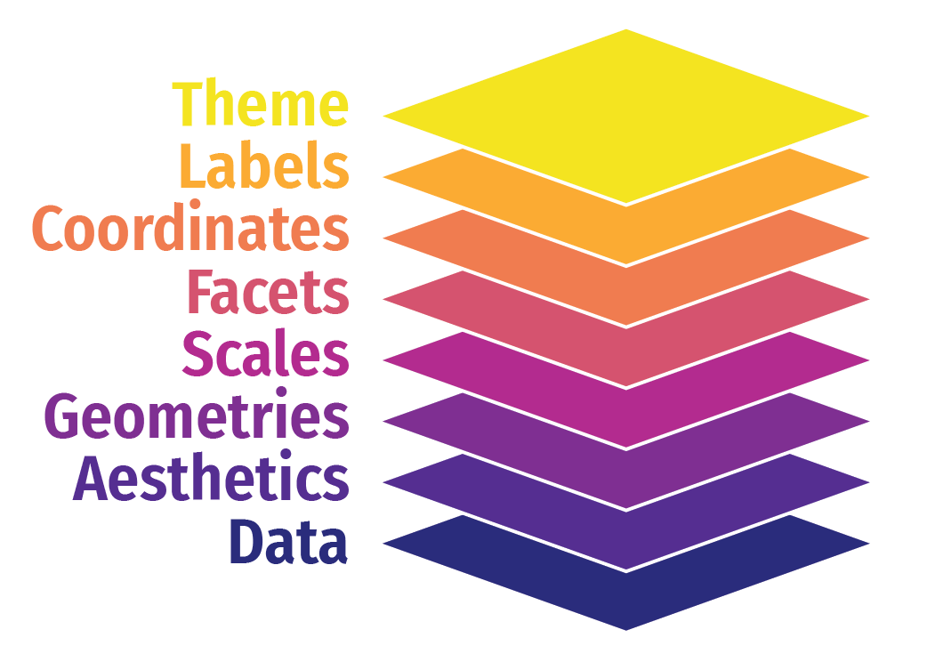 ] --- class: inverse, center, middle name: amounts # Amounts --- # Yay bar plots! We are a lot better at visualizing line lengths than angles and areas .pull-left[ <img src="07-slides_files/figure-html/example-pie-1.png" width="100%" style="display: block; margin: auto;" /> ] -- .pull-right[ <img src="07-slides_files/figure-html/example-bar-1.png" width="100%" style="display: block; margin: auto;" /> ] --- # Oh no bar plots! .center[ <figure> <img src="img/07/obamacareenrollment-fncchart.jpg" alt="Fox News Obamacare enrollment" title="Fox News Obamacare enrollment" width="85%"> </figure> ] --- # What went wrong? .center[ <figure> <img src="img/07/obamacareenrollment-fncchart.jpg" alt="Fox News Obamacare enrollment" title="Fox News Obamacare enrollment" width="85%"> </figure> ] --- # What went wrong? .pull-left.center[ <figure> <img src="img/07/female-height.png" alt="Average female height per country" title="Average female height per country" width="100%"> </figure> ] -- .pull-right[ **At least two problems:** 1. truncated y axis 2. area scales faster than height .small[This terrible figure brought to you by a former AEM 2850 / 5850 student!] ] --- # General rules for bar charts Useful when the length of the bar is all that matters -- Bar charts should always start at zero - Or: don't use bars! -- Don't use bars for summary statistics. You throw away too much information. - We will come back to visualizing distributions / uncertainty next week --- class: inverse, center, middle name: plotting-amounts # Plotting amounts using ggplot --- # Plotting amounts using ggplot We'll use a summarized version of the gapminder dataset for examples ``` r library(gapminder) gapminder_continents <- gapminder |> filter(year == 2007) |> # only look at 2007 count(continent) |> # count the number of countries per continent arrange(desc(n)) # sort by count, descending gapminder_continents ``` ``` ## # A tibble: 5 × 2 ## continent n ## <fct> <int> ## 1 Africa 52 ## 2 Asia 33 ## 3 Europe 30 ## 4 Americas 25 ## 5 Oceania 2 ``` --- # Start with a simple bar plot .left-code.small-code[ ``` r gapminder_continents |> ggplot(aes(x = continent, # continent to x y = n)) + # n countries to y * geom_col() # add bars ``` How could we improve this? ] .right-plot[  ] --- # Start with a simple bar plot .left-code.small-code[ ``` r gapminder_continents |> ggplot(aes(x = continent, # continent to x y = n)) + # n countries to y * geom_col() # add bars ``` Is "n" a good axis title? Do we need "continent" at all? ] .right-plot[ 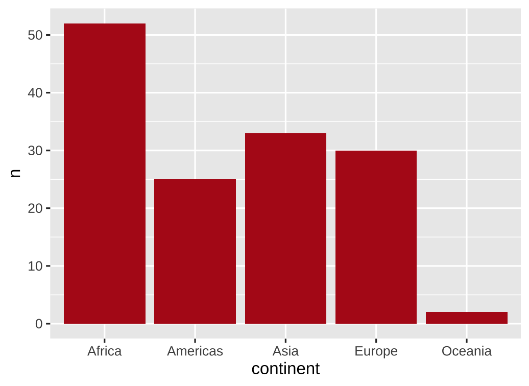 ] --- # Add some labels .left-code.small-code[ ``` r gapminder_continents |> ggplot(aes(x = continent, y = n)) + geom_col() + * labs(x = NULL, y = "Number of countries") ``` Is alphabetical the best ordering? ] .right-plot[ 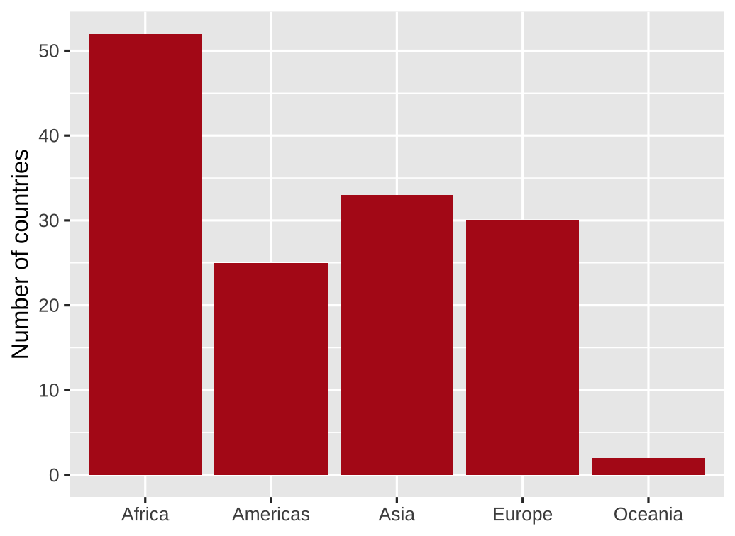 ] --- # Order by data value .left-code.small-code[ ``` r gapminder_continents |> * ggplot(aes(x = fct_reorder(continent, n), y = n)) + geom_col() + labs(x = NULL, y = "Number of countries") ``` `fct_reorder(continent, n)` means "reorder the factor variable continent by n, smallest to largest" Factor is R's term for variables that have a fixed and known set of possible values ] .right-plot[ 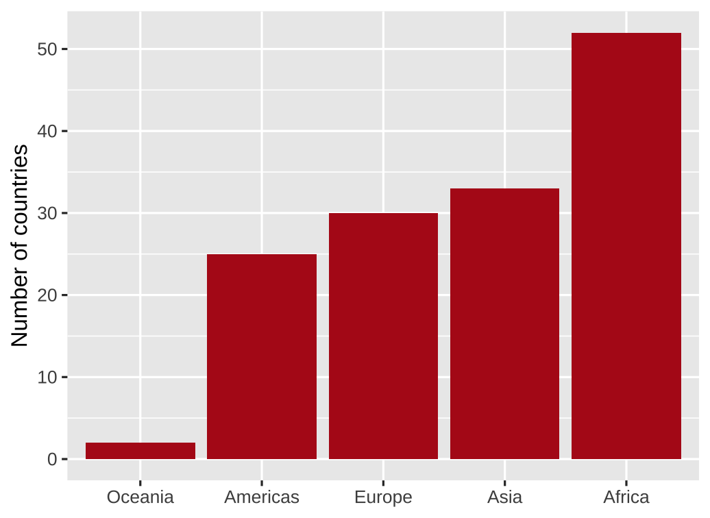 ] --- # Order by data value, descending .left-code.small-code[ ``` r gapminder_continents |> * ggplot(aes(x = fct_reorder(continent, -n), y = n)) + geom_col() + labs(x = NULL, y = "Number of countries") ``` `fct_reorder(continent, -n)` means "reorder the factor variable continent by n, largest to smallest" ] .right-plot[  ] --- # Higher dimensional datasets `as_factor()` treats `year` as distinct categories, not a continuous measure .left-code[ ``` r gapminder |> filter(year==1957 | year==2007) |> group_by(continent, year) |> summarize( lifeExp = sum(lifeExp * pop) / sum(pop) ) |> ggplot(aes(x = continent, y = lifeExp, * fill = as_factor(year))) + geom_col() + labs(x = NULL, y = "Life expectancy", fill = "Year") ``` What is wrong with this visualization of life expectancy in two different years? ] .right-plot[ 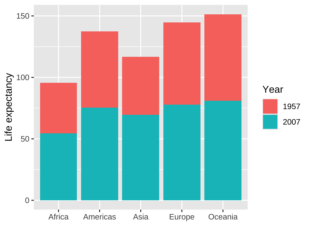 ] --- # Grouped bar charts Use grouped bars or facets for higher dimensional datasets .left-code[ ``` r gapminder |> filter(year==1957 | year==2007) |> group_by(continent, year) |> summarize( lifeExp = sum(lifeExp * pop) / sum(pop) ) |> ggplot(aes(x = continent, y = lifeExp, fill = as_factor(year))) + * geom_col(position = "dodge") + labs(x = NULL, y = "Life expectancy", fill = "Year") ``` ] .right-plot[ 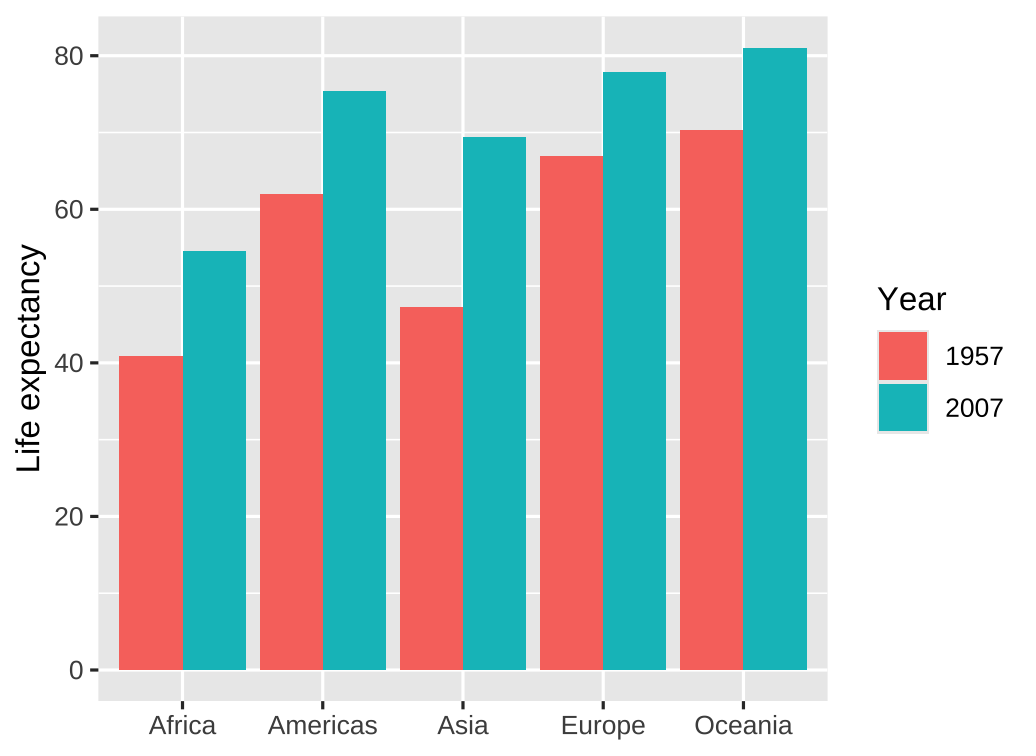 ] --- # Facets Use grouped bars or facets for higher dimensional datasets .left-code[ ``` r gapminder |> filter(year==1957 | year==2007) |> group_by(continent, year) |> summarize( lifeExp = sum(lifeExp * pop) / sum(pop) ) |> ggplot(aes(x = continent, y = lifeExp, fill = as_factor(year))) + * geom_col() + * facet_wrap(vars(year)) + * guides(fill = "none") + labs(x = NULL, y = "Life expectancy") ``` ] .right-plot[ 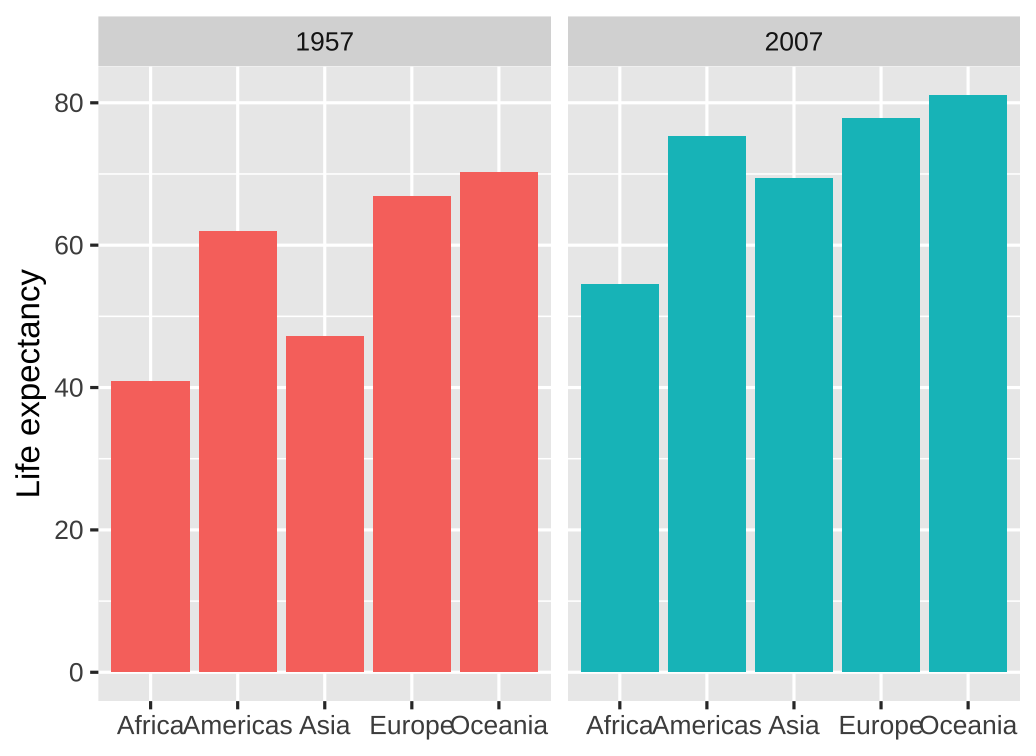 ] --- # Alternative: Dots instead of bars Dots are preferable if we want to truncate the axes .left-code[ ``` r gapminder |> filter(year == 2007, continent == "Americas") |> ggplot(aes(x = lifeExp, y = fct_reorder(country, lifeExp))) + * geom_point() + guides(color = "none") + labs(x = "Life expectancy (years)", y = NULL) + theme_minimal() ``` ] .right-plot[ 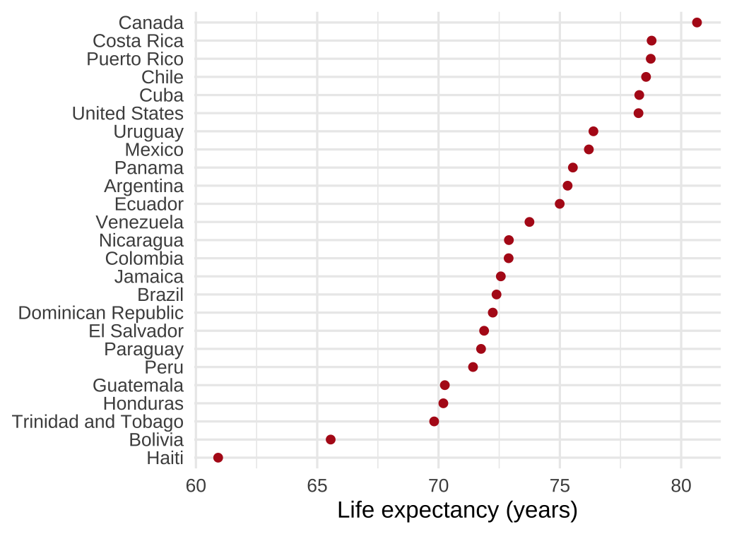 ] --- class: inverse, center, middle name: example-1 # example-07-1:<br>amounts-practice.R --- class: inverse, center, middle name: more-examples # Reference: More examples --- # Wait, what about geom_bar? Use `geom_bar` to count and plot in one step .left-code[ ``` r *gapminder |> # old data: rows are countries filter(year == 2007) |> ggplot(aes(x = continent)) + # note: no y arg * geom_bar() + labs(x = NULL, y = "Number of countries") ``` ] .right-plot[  ] --- # Wait, what about geom_bar? Here we can reorder by frequency using `fct_infreq` .left-code[ ``` r gapminder |> filter(year == 2007) |> * ggplot(aes(x = fct_infreq(continent))) + geom_bar() + labs(x = NULL, y = "Number of countries") ``` ] .right-plot[  ] --- # We can also flip geom_col/bar axes Simply use `y = ` instead of `x = ` for the aesthetic mapping .left-code[ ``` r gapminder |> filter(year == 2007) |> * ggplot(aes(y = fct_infreq(continent))) + geom_bar() + * labs(x = "Number of countries", y = NULL) ``` ] .right-plot[  ] --- # We can also flip geom_col/bar axes `fct_rev()` reverses the order of factors .left-code[ ``` r gapminder |> filter(year == 2007) |> * ggplot(aes(y = fct_rev(fct_infreq(continent)))) + geom_bar() + labs(x = "Number of countries", y = NULL) ``` ] .right-plot[  ] --- class: inverse, center, middle name: proportions # Proportions --- # Last class we plotted amounts <img src="07-slides_files/figure-html/unnamed-chunk-6-1.png" width="1008" style="display: block; margin: auto;" /> --- # How else could we visualize these data? <img src="07-slides_files/figure-html/unnamed-chunk-7-1.png" width="1008" style="display: block; margin: auto;" /> --- # Have you done any programming before? .pull-left-3[ <img src="07-slides_files/figure-html/unnamed-chunk-8-1.png" width="648" style="display: block; margin: auto;" /> ] .pull-middle-3[ <img src="07-slides_files/figure-html/unnamed-chunk-9-1.png" width="648" style="display: block; margin: auto;" /> ] .pull-right-3[ <img src="07-slides_files/figure-html/unnamed-chunk-10-1.png" width="648" style="display: block; margin: auto;" /> ] -- Which do you think is best? -- Does it depend on what you want to communicate? --- # Pros and cons of different approaches .small.center[ | Pie chart | Stacked bars | Side-by-side bars :---------- | :-------: | :----------: | :---------------: Allows easy comparison of relative proportions | | | ] --- # Pros and cons of different approaches .small.center[ | Pie chart | Stacked bars | Side-by-side bars :---------- | :-------: | :----------: | :---------------: Allows easy comparison of relative proportions | ✖ | ✖ | ✔ ] --- # Pros and cons of different approaches .small.center[ | Pie chart | Stacked bars | Side-by-side bars :---------- | :-------: | :----------: | :---------------: Allows easy comparison of relative proportions | ✖ | ✖ | ✔ Shows data as proportions of a whole | | | ] --- # Pros and cons of different approaches .small.center[ | Pie chart | Stacked bars | Side-by-side bars :---------- | :-------: | :----------: | :---------------: Allows easy comparison of relative proportions | ✖ | ✖ | ✔ Shows data as proportions of a whole | ✔ | ✔ | ✖ ] --- # Pros and cons of different approaches .small.center[ | Pie chart | Stacked bars | Side-by-side bars :---------- | :-------: | :----------: | :---------------: Allows easy comparison of relative proportions | ✖ | ✖ | ✔ Shows data as proportions of a whole | ✔ | ✔ | ✖ Emphasizes simple fractions (1/2, 1/3, ...) | | | ] --- # Pros and cons of different approaches .small.center[ | Pie chart | Stacked bars | Side-by-side bars :---------- | :-------: | :----------: | :---------------: Allows easy comparison of relative proportions | ✖ | ✖ | ✔ Shows data as proportions of a whole | ✔ | ✔ | ✖ Emphasizes simple fractions (1/2, 1/3, ...) | ✔ | ✖ | ✖ ] --- # Pros and cons of different approaches .small.center[ | Pie chart | Stacked bars | Side-by-side bars :---------- | :-------: | :----------: | :---------------: Allows easy comparison of relative proportions | ✖ | ✖ | ✔ Shows data as proportions of a whole | ✔ | ✔ | ✖ Emphasizes simple fractions (1/2, 1/3, ...) | ✔ | ✖ | ✖ Visually appealing for small datasets | | | ] --- # Pros and cons of different approaches .small.center[ | Pie chart | Stacked bars | Side-by-side bars :---------- | :-------: | :----------: | :---------------: Allows easy comparison of relative proportions | ✖ | ✖ | ✔ Shows data as proportions of a whole | ✔ | ✔ | ✖ Emphasizes simple fractions (1/2, 1/3, ...) | ✔ | ✖ | ✖ Visually appealing for small datasets | ✔ | ✖ | ✔ ] --- # Pros and cons of different approaches .small.center[ | Pie chart | Stacked bars | Side-by-side bars :---------- | :-------: | :----------: | :---------------: Allows easy comparison of relative proportions | ✖ | ✖ | ✔ Shows data as proportions of a whole | ✔ | ✔ | ✖ Emphasizes simple fractions (1/2, 1/3, ...) | ✔ | ✖ | ✖ Visually appealing for small datasets | ✔ | ✖ | ✔ Works well for a large number of subsets | | | ] --- # Pros and cons of different approaches .small.center[ | Pie chart | Stacked bars | Side-by-side bars :---------- | :-------: | :----------: | :---------------: Allows easy comparison of relative proportions | ✖ | ✖ | ✔ Shows data as proportions of a whole | ✔ | ✔ | ✖ Emphasizes simple fractions (1/2, 1/3, ...) | ✔ | ✖ | ✖ Visually appealing for small datasets | ✔ | ✖ | ✔ Works well for a large number of subsets | ✖ | ✖ | ✔ ] --- # Pros and cons of different approaches .small.center[ | Pie chart | Stacked bars | Side-by-side bars :---------- | :-------: | :----------: | :---------------: Allows easy comparison of relative proportions | ✖ | ✖ | ✔ Shows data as proportions of a whole | ✔ | ✔ | ✖ Emphasizes simple fractions (1/2, 1/3, ...) | ✔ | ✖ | ✖ Visually appealing for small datasets | ✔ | ✖ | ✔ Works well for a large number of subsets | ✖ | ✖ | ✔ Works well for time series and similar | | | ] --- # Pros and cons of different approaches .small.center[ | Pie chart | Stacked bars | Side-by-side bars :---------- | :-------: | :----------: | :---------------: Allows easy comparison of relative proportions | ✖ | ✖ | ✔ Shows data as proportions of a whole | ✔ | ✔ | ✖ Emphasizes simple fractions (1/2, 1/3, ...) | ✔ | ✖ | ✖ Visually appealing for small datasets | ✔ | ✖ | ✔ Works well for a large number of subsets | ✖ | ✖ | ✔ Works well for time series and similar | ✖ | ✔ | ✖ ] -- No one visualization fits all scenarios! --- # Side-by-side bars using ggplot How could we use ggplot to visualize *proportions* using side-by-side bars? -- .pull-left[ We could do it manually: ``` r prior_programming |> * count(prior_programming) |> * mutate(share = n / sum(n)) |> ggplot(aes( x = prior_programming, y = share )) + geom_col() + labs(x = NULL, y = "share of students") ``` How could we reverse the bars' order? ] .right-plot[  ] --- # Side-by-side bars using ggplot <br> .pull-left[ ``` r prior_programming |> count(prior_programming) |> mutate(share = n / sum(n)) |> ggplot(aes( * x = fct_reorder( * prior_programming, * -share * ), y = share )) + geom_col() + labs(x = NULL, y = "share of students") ``` ] .right-plot[  ] --- # Side-by-side bars using ggplot `fct_rev()` also works well since there are only two categories: .pull-left[ ``` r prior_programming |> count(prior_programming) |> mutate(share = n / sum(n)) |> ggplot(aes( * x = fct_rev(prior_programming), y = share )) + geom_col() + labs(x = NULL, y = "share of students") ``` ] .right-plot[  ] --- # Stacked bars using ggplot How could we use ggplot to visualize *proportions* using stacked bars? -- .pull-left[ Again, we could do it manually: ``` r prior_programming |> count(prior_programming) |> mutate(share = n / sum(n)) |> ggplot(aes( * x = "", # provide dummy to x * y = share, # plot shares on y * fill = prior_programming )) + geom_col() ``` By default, `geom_col` stacks bars if they fall in the same place (`x`) ] .right-plot[  ] --- # Stacked bars using ggplot Alternatively, we could use `geom_bar()` to count and plot the data for us .pull-left[ ``` r prior_programming |> ggplot(aes( x = "", fill = prior_programming )) + geom_bar() ``` But this gives us *counts*. We want *shares*! ] .right-plot[  ] --- # Stacked bars using ggplot The argument `position = "fill"` scales everything to sum to 1 .pull-left[ ``` r prior_programming |> ggplot(aes( x = "", fill = prior_programming )) + * geom_bar(position = "fill") + labs(x = NULL, y = "share") ``` ] .right-plot[  ] --- # Pie charts using ggplot How could we use ggplot to visualize *proportions* using a pie chart? -- Pie charts are just stacked bars in polar coordinates .pull-left[ ``` r prior_programming |> ggplot(aes( * y = "", # y, not x fill = prior_programming )) + geom_bar(position = "fill") + * coord_polar() # convert to polar coordinates ``` ] .right-plot[  ] --- # Pie charts using ggplot It takes some work to create a clean pie chart using ggplot! .pull-left[ ``` r prior_programming |> ggplot(aes( y = "", fill = fct_rev(prior_programming) )) + geom_bar(position = "fill") + coord_polar() + scale_x_continuous( name = NULL, breaks = NULL ) + scale_y_discrete( name = NULL, breaks = NULL ) + labs( title = "Share of students with\nprior programming experience", fill = NULL ) ``` ] .right-plot[  ] --- class: inverse, center, middle name: example-2 # example-07-2:<br>proportions-practice.R --- class: inverse, center, middle name: additional-layers # Reference: Additional layers --- # Additional layers .pull-left[ The next several slides contains a preview of additional layers These are intended as a reference ] .pull-right[  ] --- # Aesthetics .pull-left-3.center[ `color` (discrete) <img src="07-slides_files/figure-html/aes-color-discrete-1.png" width="100%" style="display: block; margin: auto;" /> `color` (continuous) <img src="07-slides_files/figure-html/aes-color-continuous-1.png" width="100%" style="display: block; margin: auto;" /> ] .pull-middle-3.center[ `size` <img src="07-slides_files/figure-html/aes-size-1.png" width="100%" style="display: block; margin: auto;" /> `fill` <img src="07-slides_files/figure-html/aes-fill-1.png" width="100%" style="display: block; margin: auto;" /> ] .pull-right-3.center[ `shape` <img src="07-slides_files/figure-html/aes-shape-1.png" width="100%" style="display: block; margin: auto;" /> `alpha` (opacity) <img src="07-slides_files/figure-html/aes-alpha-1.png" width="100%" style="display: block; margin: auto;" /> ] --- # Geometries <table> <tr> <th class="cell-left"></th> <th class="cell-left">Example geometry</th> <th class="cell-left">What it makes</th> </tr> <tr> <td class="cell-left"><img src="img/07/geom_bar.png"></td> <td class="cell-left"><code class="remark-inline-code">geom_col()</code></td> <td class="cell-left">Bar charts</td> </tr> <tr> <td class="cell-left"><img src="img/07/geom_text.png"></td> <td class="cell-left"><code class="remark-inline-code">geom_text()</code></td> <td class="cell-left">Text</td> </tr> <tr> <td class="cell-left"><img src="img/07/geom_point.png"></td> <td class="cell-left"><code class="remark-inline-code">geom_point()</code></td> <td class="cell-left">Points</td> </tr> <tr> <td class="cell-left"><img src="img/07/geom_boxplot.png"></td> <td class="cell-left"><code class="remark-inline-code">geom_boxplot()</code> </td> <td class="cell-left">Boxplots</td> </tr> <tr> <td class="cell-left"><img src="img/07/geom_sf.png"></td> <td class="cell-left"><code class="remark-inline-code">geom_sf()</code></td> <td class="cell-left">Maps</td> </tr> </table> --- # Geometries There are dozens of possible geometries Over the next several weeks we will cover a number of them See [the **ggplot2** documentation](https://ggplot2.tidyverse.org/reference/index.html#section-layer-geoms) for examples of all the different geometry layers --- # Scales Scales change the properties of the variable mapping <table> <tr> <th class="cell-left">Example layer</th> <th class="cell-left">What it does</th> </tr> <tr> <td class="cell-left"><code class="remark-inline-code">scale_x_continuous()</code></td> <td class="cell-left">Make the x-axis continuous</td> </tr> <tr> <td class="cell-left"><code class="remark-inline-code">scale_x_continuous(breaks = 1:5) </code></td> <td class="cell-left">Manually specify axis ticks</td> </tr> <tr> <td class="cell-left"><code class="remark-inline-code">scale_x_log10()</code></td> <td class="cell-left">Log the x-axis</td> </tr> <tr> <td class="cell-left"><code class="remark-inline-code">scale_color_gradient()</code></td> <td class="cell-left">Use a gradient</td> </tr> <tr> <td class="cell-left"><code class="remark-inline-code">scale_fill_viridis_d()</code></td> <td class="cell-left">Fill with discrete viridis colors</td> </tr> </table> --- # Scales .pull-left[ .center[`scale_x_log10()`] <img src="07-slides_files/figure-html/scale-example-1-1.png" width="100%" style="display: block; margin: auto;" /> ] -- .pull-right[ .center[`scale_color_viridis_d()`] <img src="07-slides_files/figure-html/scale-example-2-1.png" width="100%" style="display: block; margin: auto;" /> ] --- # Facets Facets show subplots for different subsets of data <table> <tr> <th class="cell-left">Example layer</th> <th class="cell-left">What it does</th> </tr> <tr> <td class="cell-left"><code class="remark-inline-code">facet_wrap(vars(continent))</code></td> <td class="cell-left">Plot for each continent</td> </tr> <tr> <td class="cell-left"><code class="remark-inline-code">facet_wrap(vars(continent, year))</code> </td> <td class="cell-left">Plot for each continent/year</td> </tr> <tr> <td class="cell-left"><code class="remark-inline-code">facet_wrap(..., ncol = 1)</code></td> <td class="cell-left">Put all facets in one column</td> </tr> <tr> <td class="cell-left"><code class="remark-inline-code">facet_wrap(..., nrow = 1)</code></td> <td class="cell-left">Put all facets in one row</td> </tr> </table> --- # Facets .pull-left[ .center.small[`facet_wrap(vars(continent))`] <img src="07-slides_files/figure-html/facet-example-1-1.png" width="100%" style="display: block; margin: auto;" /> ] -- .pull-right[ .center.small[`facet_wrap(vars(continent, year))`] <img src="07-slides_files/figure-html/facet-example-2-1.png" width="100%" style="display: block; margin: auto;" /> ] --- # Coordinates Change the coordinate system <table> <tr> <th class="cell-left">Example layer</th> <th class="cell-left">What it does</th> </tr> <tr> <td class="cell-left"><code class="remark-inline-code">coord_cartesian(ylim = c(1, 10))</code> </td> <td class="cell-left">Zoom in where y is 1–10</td> </tr> <tr> <td class="cell-left"><code class="remark-inline-code">coord_flip()</code></td> <td class="cell-left">Switch x and y</td> </tr> <tr> <td class="cell-left"><code class="remark-inline-code">coord_polar()</code></td> <td class="cell-left">Use polar coordinates</td> </tr> </table> --- # Coordinates .pull-left[ .center.small[`coord_cartesian(ylim = c(70, 80), xlim = c(10000, 30000))`] <img src="07-slides_files/figure-html/coord-example-1-1.png" width="100%" style="display: block; margin: auto;" /> ] -- .pull-right[ .center.small[`coord_flip()`] <img src="07-slides_files/figure-html/coord-example-2-1.png" width="100%" style="display: block; margin: auto;" /> ] --- # Labels Add labels to the plot with a single `labs()` layer <table> <tr> <th class="cell-left">Example layer</th> <th class="cell-left">What it does</th> </tr> <tr> <td class="cell-left"><code class="remark-inline-code">labs(title = "Neat title")</code></td> <td class="cell-left">Title</td> </tr> <tr> <td class="cell-left"><code class="remark-inline-code">labs(caption = "Something")</td> <td class="cell-left">Caption</td> </tr> <tr> <td class="cell-left"><code class="remark-inline-code">labs(y = "Something")</td> <td class="cell-left">y-axis</td> </tr> <tr> <td class="cell-left"><code class="remark-inline-code">labs(size = "Population")</code></td> <td class="cell-left">Title of size legend</td> </tr> </table> --- # Labels .left-code[ ``` r gapminder_2007 |> ggplot(aes(x = gdpPercap, y = lifeExp, color = continent, size = pop)) + geom_point() + scale_x_log10() + labs(title = "Health and wealth go together", subtitle = "Data from 2007", x = "Wealth (GDP per capita)", y = "Health (life expectancy)", color = "Continent", size = "Population", caption = "Source: The Gapminder Project") ``` ] .right-plot[  ] --- # Theme `theme()` can be used to change the appearance of anything in a plot Lots of themes built in and available from other packages <table> <tr> <th class="cell-left">Example layer</th> <th class="cell-left">What it does</th> </tr> <tr> <td class="cell-left"><code class="remark-inline-code">theme_grey()</code></td> <td class="cell-left">Default grey background</td> </tr> <tr> <td class="cell-left"><code class="remark-inline-code">theme_bw()</td> <td class="cell-left">Black and white</td> </tr> <tr> <td class="cell-left"><code class="remark-inline-code">theme_dark()</td> <td class="cell-left">Dark</td> </tr> <tr> <td class="cell-left"><code class="remark-inline-code">theme_minimal()</code></td> <td class="cell-left">Minimal</td> </tr> </table> --- # Theme .pull-left[ .center.small[`theme_dark()`] <img src="07-slides_files/figure-html/theme-example-1-1.png" width="100%" style="display: block; margin: auto;" /> ] -- .pull-right[ .center.small[`theme_minimal()`] <img src="07-slides_files/figure-html/theme-example-2-1.png" width="100%" style="display: block; margin: auto;" /> ] --- # Theme There are collections of pre-built themes online, like [the **ggthemes** package](https://jrnold.github.io/ggthemes/) .center[ <figure> <img src="img/07/ggthemes.png" alt="ggthemes" title="ggthemes" width="55%"> </figure> ] --- # Theme Organizations often make their own custom themes, like [the BBC](https://bbc.github.io/rcookbook/) .center[ <figure> <img src="img/07/bbc-cookbook.png" alt="ggthemes" title="ggthemes" width="80%"> </figure> ] --- # Theme Make individual theme adjustments with `theme()` ``` r theme_bw() + theme(legend.position = "bottom", plot.title = element_text(face = "bold"), panel.grid = element_blank(), axis.title.y = element_text(face = "italic")) ``` --- # So many possibilities! .pull-left[  ] .pull-right[ These were just a few examples See [the **ggplot2** documentation](https://ggplot2.tidyverse.org/reference/index.html) for examples of everything you can do ]